High-Converting Annual Report Design That Builds Trust and Drives Stakeholder Action
A strong annual report is no longer just a formal publication prepared at the end of a financial year. It has evolved into a strategic communication asset that influences how investors, board members, clients, regulators, and business partners perceive a company. This is exactly why high-converting annual report design matters. A report that only looks polished but lacks structure will not persuade serious stakeholders. At the same time, a report filled with valuable data but presented in a dense and confusing way will fail to create engagement. The most effective reports succeed because they combine clarity, hierarchy, visual intelligence, and corporate storytelling in one cohesive presentation.
When people hear the word “converting” in relation to annual reports, they often think only in marketing terms. In a corporate reporting context, however, conversion is broader and more meaningful. A high-converting annual report encourages the reader to stay engaged, absorb the key message, trust the company’s direction, and form a stronger impression of the brand. It converts raw information into confidence. It turns numbers into narrative. It transforms business complexity into a document that feels structured, credible, and easy to understand. This is where effective annual report design becomes essential, because design is not decoration. It is the system that shapes how information is received and interpreted.
An investor-focused report design also helps a company communicate seriousness. Investors do not want to search through cluttered pages, inconsistent charts, overloaded spreads, or weak visual hierarchy just to understand performance. They want to see leadership clarity, strategic direction, financial discipline, and thoughtful presentation. The same principle applies to annual report readability. If stakeholders struggle to follow the story, the report loses impact regardless of how strong the business performance may be. Clear typography, logical section flow, concise visual cues, and disciplined layout planning all contribute to a better reading experience.
A truly strategic annual report layout does more than present content in order. It creates momentum throughout the report. Each section supports the next, each message has room to breathe, and each design choice reinforces trust. For brands that want their reports to feel premium and persuasive, this balance between clarity and corporate presence is critical. A studio like Alivea understands that a well-designed report should not only look professional, but also function as a strategic business communication tool that strengthens perception and supports long-term brand value.
High-Converting Annual Report Design Starts With Clarity, Hierarchy, and Intent
The foundation of high-converting annual report design is not color, style, or visual flair. It begins with intent. Before layout decisions are made, the company needs to understand what the report must achieve. A well-designed report should communicate performance, reinforce strategic direction, strengthen investor confidence, and reflect the professionalism of the brand. Without that objective, even a visually attractive report can feel empty. A high-converting report works because every section, headline, chart, image, and narrative element serves a clear purpose.
One of the most important characteristics of a high-converting annual report is information hierarchy. Stakeholders do not read corporate reports the same way they read novels. They scan, evaluate, pause, compare, and revisit sections based on relevance. This means the report must guide attention intelligently. The cover should create authority. The opening pages should establish business identity and direction. Leadership messages should clarify confidence and accountability. Financial highlights should be easy to absorb at a glance. Strategic sections should provide depth without overwhelming the reader. This balance is where effective annual report design separates itself from generic reporting.
Another essential element is narrative control. A company may have strong financial results, a credible strategy, and a positive market outlook, but if the report presents these elements in a fragmented order, the story feels weaker than it should. Strong investor-focused report design arranges information in a way that helps readers understand not only what happened, but why it matters. Good design creates flow between performance, business model, governance, risks, initiatives, and outlook. It gives context to numbers and gives meaning to corporate direction.
This also has a direct impact on annual report readability. Clear page structure, balanced typography, clean margins, and disciplined use of graphics allow the reader to focus on meaning instead of struggling with presentation. Many reports fail because they try to include too much on every page. High-converting reports do the opposite. They simplify without weakening substance. They understand that white space is not wasted space. It is part of the reading experience and part of what makes information feel valuable.
A strategic annual report layout also protects credibility. When content is arranged well, the business appears organised, thoughtful, and in control of its message. That perception matters. Stakeholders often judge the maturity of a company not only by the quality of the numbers, but also by the quality of the communication. This is why report design should never be treated as the final cosmetic layer. It should be treated as a core part of corporate storytelling. Alivea approaches annual report design from this perspective, helping brands create reporting systems that are visually refined, content-led, and built to support stronger business trust.
Effective Annual Report Design Turns Complex Information Into Clear Business Value
Effective annual report design is ultimately about translation. Every company has complexity. There are multiple business units, operational priorities, performance metrics, governance disclosures, market conditions, future plans, and stakeholder expectations to communicate within one document. The challenge is not whether the content exists. The challenge is whether the design can translate that content into something clear, engaging, and persuasive. A report becomes effective when it allows readers to understand the business without feeling burdened by the report itself.
One major reason annual reports underperform is that they are often created with a documentation mindset rather than a communication mindset. The focus becomes compiling content instead of shaping understanding. This leads to crowded pages, weak transitions, repetitive messaging, and layout inconsistency. In contrast, high-converting annual report design begins by identifying which messages matter most and how those messages should be experienced by the reader. It recognises that report structure has a direct influence on trust. A coherent report suggests coherent leadership. A confusing report suggests a lack of editorial discipline, even when the underlying business is solid.
This is where investor-focused report design becomes especially valuable. Investors and decision-makers are usually pressed for time. They want to identify key insights quickly while still having access to depth when needed. Effective design supports both behaviours. It provides strong summaries, intuitive navigation, clean charts, readable tables, and clearly separated content blocks. It uses typography and layout to signal importance rather than relying on excessive styling. It reduces friction and increases confidence. When readers can move through the report with ease, they are more likely to engage with the company’s core message.
The relationship between design and annual report readability should never be underestimated. Readability is not only about sentence length or font size. It is about how the entire report behaves. Does the report guide the reader? Does it create logical entry points? Does it avoid visual fatigue? Does it help the audience understand the story behind the numbers? A report can contain excellent financial data and still fail if the reading experience feels exhausting. The most effective reports make serious content feel accessible without reducing its sophistication.
A strong strategic annual report layout is what makes this possible. It creates a system for presenting business value in layers. High-level highlights come first. Supporting detail follows naturally. Visual rhythm keeps the document engaging without becoming inconsistent. Each spread feels connected to the larger narrative. This is the kind of report that supports not only compliance, but also brand positioning. Alivea understands this balance well, helping businesses transform dense corporate content into reporting assets that feel confident, intelligent, and commercially credible.
Investor-Focused Report Design Strengthens Confidence Beyond the Numbers Alone
An annual report may be filled with revenue figures, operational results, growth indicators, and strategic statements, but none of that guarantees confidence if the report fails to communicate with the needs of investors in mind. This is why investor-focused report design is a defining feature of strong annual reporting. Investors do not simply want information. They want information organised in a way that helps them evaluate management quality, strategic discipline, market direction, and long-term potential. Design plays a direct role in shaping that experience.
A truly investor-focused report begins with understanding how serious readers engage with corporate information. They are looking for key performance insights, business drivers, risk context, governance credibility, and evidence that the leadership team understands where the company stands. A report that buries these insights beneath decorative layouts or generic messaging creates distance rather than trust. By contrast, high-converting annual report design prioritises relevance. It highlights what matters, provides structure for deeper analysis, and uses design to support faster comprehension.
This does not mean the report should feel cold or purely technical. In fact, one of the strengths of effective annual report design is that it can make corporate content more compelling without losing professionalism. Leadership messages can feel more purposeful when they are framed by clean design and strong visual rhythm. Performance highlights become more persuasive when data is presented with clarity. Strategy sections feel more credible when the design avoids clutter and allows each message to stand on its own. In this sense, design acts as a confidence amplifier. It helps the reader focus on substance by removing unnecessary friction.
There is also a clear relationship between investor trust and annual report readability. A readable report signals respect for the audience. It suggests that the company has taken the time to organise its message and present it with discipline. Investors notice when charts are too dense, when page flow feels random, or when key information is buried inside large paragraphs. These issues are not minor. They shape how the company is perceived. A report that feels difficult to navigate can unintentionally suggest internal disorder. A readable report, on the other hand, gives the impression of control, preparation, and professionalism.
A strategic annual report layout also helps investors connect short-term results with long-term direction. Rather than presenting isolated facts, it builds a sense of logic across the report. Business performance links to strategy. Strategy links to governance. Governance links to resilience. This layered structure is what turns a corporate document into a persuasive narrative tool. For companies that want to look more mature in the eyes of investors and stakeholders, Alivea helps create report designs that are not only visually polished but also strategically aligned with confidence-building communication.
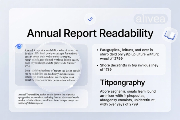
Annual Report Readability Improves Engagement, Retention, and Brand Credibility
Annual report readability is one of the most underestimated drivers of report effectiveness. Many businesses assume that as long as the required information is included, the report has done its job. In reality, inclusion is only the starting point. What matters just as much is whether the information can be read, understood, and retained without unnecessary effort. Readability is what transforms a report from a static file into a communication experience that actually works.
Readable annual reports are built through a combination of editorial discipline and design intelligence. The typography must be legible. The headings must create a clear hierarchy. The spacing must allow the eye to move naturally. The charts must simplify, not complicate. The body copy must be broken into digestible sections. The visual rhythm must support concentration rather than interrupt it. When these elements are missing, even a strong report becomes tiring. When they are handled well, the report feels lighter, clearer, and more authoritative.
This is why high-converting annual report design is closely tied to readability. Conversion in this context means sustained engagement and stronger trust. A report that is easy to read keeps stakeholders inside the story for longer. It helps them absorb key performance indicators, remember strategic themes, and build a more coherent understanding of the company. It also increases the likelihood that leadership messages, governance highlights, and future plans will actually be noticed rather than skimmed over.
Readability is equally important in investor-focused report design because professional audiences often compare multiple companies within a limited timeframe. A report that respects their attention stands out. It allows quick scanning for essential takeaways while also rewarding deeper reading. This dual function is critical. Reports must support both overview reading and detailed review. The best way to achieve this is through careful layout planning, disciplined editorial structure, and content prioritisation.
A well-executed strategic annual report layout enhances readability by making each section feel intentional. Rather than forcing too much content into one spread, it gives room to important messages. Rather than relying on decorative treatment, it uses structure to create elegance. Rather than overwhelming the reader with constant visual change, it creates consistency that feels reassuring and professional. This does more than improve comprehension. It also improves brand impression. A readable report suggests that the company knows how to communicate with sophistication and control.
For brands that want their reports to feel premium, readability should never be an afterthought. It should be one of the design priorities from the beginning. Alivea understands that readability is not simply a technical feature. It is part of how trust is built on the page, and part of what makes a report feel genuinely high quality.
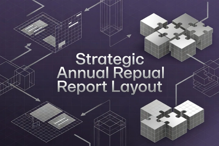
Strategic Annual Report Layout Creates Flow, Logic, and Stronger Corporate Perception
A strategic annual report layout is what turns a collection of corporate content into a persuasive and coherent business document. Without strategy, layout becomes decoration. With strategy, layout becomes a system for guiding attention, reinforcing credibility, and helping the reader move through information with clarity. This is one of the main reasons why some annual reports feel authoritative and engaging, while others feel crowded, repetitive, or forgettable.
Layout strategy begins with sequence. The report should not simply follow the order in which content was collected. It should follow the order in which understanding is best built. That usually means starting with identity, leadership perspective, and high-level performance before moving into business review, strategic progress, governance, financial detail, and future direction. This order matters because it shapes perception. A report that begins well creates confidence early. A weak opening can reduce engagement before the core content is even reached. That is why high-converting annual report design depends so heavily on thoughtful layout planning.
Another important factor is pacing. A strong layout knows when to summarise and when to expand. Not every page should feel equally dense. Some spreads should provide visual breathing space and reinforce headline messages. Others should carry more detailed information for deeper analysis. This controlled rhythm is central to effective annual report design because it prevents fatigue and helps the audience stay engaged across a long document. It also gives greater authority to important sections by allowing them proper prominence.
In investor-focused report design, layout is especially important because it influences how efficiently information can be evaluated. Clear navigation, consistent grid systems, predictable section markers, and well-positioned data summaries all help serious readers move through the report with purpose. The result is a report that feels smarter and more usable. Combined with strong annual report readability, this creates a document that works not only as a compliance item but also as a strategic communication asset.
A well-considered layout also strengthens corporate identity. It can reflect maturity, confidence, and brand consistency without becoming flashy. When layout decisions are aligned with tone, typography, imagery, and messaging, the report feels more premium. Stakeholders notice this. They may not describe it in design terms, but they respond to it. A company that presents its information with structure and refinement is often assumed to operate with similar discipline internally.
This is where specialist report design becomes highly valuable. Alivea approaches layout as both a communication framework and a brand experience. The goal is not only to make the annual report look attractive, but to make it flow with logic, read with ease, and reinforce trust at every stage. That is what makes a report not just beautiful, but genuinely high-converting. Click here to learn more best annual report design agency in singapore.
What Defines a High-Converting Annual Report Design in Modern Corporate Use
A high-converting annual report design is defined by its ability to turn important corporate information into a persuasive reading experience. It does not rely only on visual beauty or premium graphics. Instead, it combines message clarity, strong structure, accessible data presentation, thoughtful pacing, and consistent brand expression. The report should help readers understand business performance, trust the leadership narrative, and engage with the company’s direction. In modern corporate use, a high-converting report is one that reduces confusion, improves confidence, and makes the company appear organised, credible, and strategically mature. Design becomes successful when it supports decision-making rather than distracting from it.
Who Needs Investor-Focused Report Design the Most in Competitive Markets
Any company that depends on investor confidence, stakeholder trust, board-level visibility, or strong corporate reputation can benefit from investor-focused report design. Public companies are obvious examples, but private firms, growing enterprises, institutions, and corporate groups also need reports that communicate with precision. In competitive markets, the quality of a report can influence how seriously the company is taken. Businesses with expansion plans, fundraising goals, governance ambitions, or regional visibility needs have even more reason to invest in better reporting. A polished report signals readiness. It shows that the company values clarity and takes its external communication seriously. That impression can create advantages that extend far beyond the report itself.
Where Does Annual Report Readability Influence Stakeholder Decisions Most
Annual report readability has the greatest influence wherever stakeholders need to absorb complex information quickly and with confidence. This includes investor reviews, board presentations, lender assessments, audit discussions, procurement evaluations, strategic partnership reviews, and even website-based reputation building. In each of these settings, the report acts as a representation of the company. If the document feels clear and disciplined, the business often appears equally disciplined. If it feels confusing, overly dense, or visually weak, the opposite impression can emerge. Readability therefore matters wherever trust is being formed through documentation. It is not merely a reading convenience. It is part of how stakeholders judge business quality.
When Should a Company Redesign Its Annual Report for Better Results
A company should redesign its annual report when the current version no longer reflects its market position, growth stage, or stakeholder expectations. Common signs include cluttered pages, outdated visuals, weak hierarchy, poor data flow, low engagement from readers, or messaging that feels disconnected from the brand. A redesign is also valuable when the company wants stronger investor trust, clearer strategic communication, or more professional positioning in front of external audiences. Waiting too long often leads to reports that feel reactive rather than intentional. A smarter approach is to redesign before communication quality becomes a weakness. Strong reporting supports stronger perception, and stronger perception often supports better long-term business results.
Why Does Strategic Annual Report Layout Matter More Than Visual Style Alone
A strategic annual report layout matters more than visual style because layout determines how information is understood. Style may create first impressions, but layout shapes the full reading experience. It controls sequence, pacing, hierarchy, and navigation. A visually attractive report can still fail if the layout confuses the reader or hides what matters most. Strategic layout ensures that performance highlights, leadership messages, governance details, and financial data are presented in a logical and persuasive order. It allows design to serve meaning. In that sense, layout is the structure that holds the report together. Without it, even beautiful design can feel superficial and ineffective.
How Can Alivea Improve Effective Annual Report Design for Modern Brands
Alivea improves effective annual report design by approaching the report as a strategic corporate communication asset rather than a simple layout project. The process focuses on content hierarchy, narrative clarity, premium visual presentation, and stronger alignment between reporting structure and brand identity. This means refining how key messages are introduced, how data is visualised, how sections flow, and how the report feels as a whole. The goal is to make the annual report easier to read, stronger in perception, and more persuasive for serious stakeholders. For modern brands, this kind of support helps transform annual reporting into a clearer, more confident, and more commercially valuable document.
Why Strong Annual Report Design Converts Better Through Clarity and Confidence
The clearest answer to the question, what makes a high-converting annual report design, is that it combines clarity with confidence. The report must do more than meet formal expectations. It must guide readers through the company’s story in a way that feels organised, credible, and easy to follow. This is why high-converting annual report design is never only about visuals. It is about structure, readability, hierarchy, message flow, and the ability to make serious information feel accessible without reducing its depth.
Throughout this discussion, the same pattern has remained clear. Effective annual report design improves communication by turning complexity into order. Investor-focused report design strengthens trust by helping readers find what matters and interpret it with less friction. Annual report readability increases engagement by making the content easier to scan, understand, and retain. A strategic annual report layout brings everything together by giving the document logic, rhythm, and a strong sense of purpose. When these elements work together, the annual report becomes more than a formal record. It becomes a persuasive representation of the business itself.
This matters because stakeholders often form judgments through presentation as much as through raw information. They may not consciously analyse margins, spacing, or visual hierarchy, but they do notice when a report feels clear, premium, and professionally structured. They also notice when a report feels inconsistent, cluttered, or difficult to navigate. In that sense, design becomes part of the company’s credibility. It reflects whether the business knows how to communicate with discipline and maturity.
For brands that want stronger results from annual reporting, the opportunity is significant. A better report can improve trust, support investor relations, strengthen corporate identity, and make complex performance narratives far more compelling. That is why thoughtful design should be treated as a strategic investment rather than a finishing touch. Alivea helps businesses bring this standard into their reporting by combining content intelligence, layout strategy, and premium design execution. When done well, annual report design does not just look better. It converts better because it helps the company communicate with greater authority, clarity, and impact.