A fund fact sheet is one of the most important documents in financial communication, but it’s also one of the most misunderstood.
Investors rely on fund fact sheets to make quick, confident decisions. Fund managers use them to communicate strategy, performance, and value. Yet many fact sheets end up cluttered, overly technical, or so visually overwhelming that readers give up halfway through. In reality, a well-designed fund fact sheet is straightforward: It delivers the right information, in the right order, in a format that investors can understand instantly.
What Is a Fund Fact Sheet?
A fund fact sheet is a short, structured document, usually one or two pages, that summarises the essential details of an investment fund. It gives investors a snapshot of what the fund does, how it performs, what it invests in, and how much risk it carries.
People often describe it as a fund’s “resume” or a one-page investment summary, some also called it a quick reference for investors and advisors. A clear fund fact sheet helps readers evaluate suitability, compare funds, and make informed decisions without flipping through lengthy prospectuses or annual reports. Learn more about what it is here.
Why Fund Fact Sheets Matter for Investors
Today’s investors, millennials, Gen Z, and increasingly digital-first professionals, expect clear, simple, and transparent information. A strong fund fact sheet helps them understand a fund’s investment strategy, compare performance and risk and evaluate whether the fund matches their goals. It allows them to make decisions based on clarity, not guesswork. It’s essential because you would like to build trust and in financial communication, trust is everything.
Sample Design, Please?
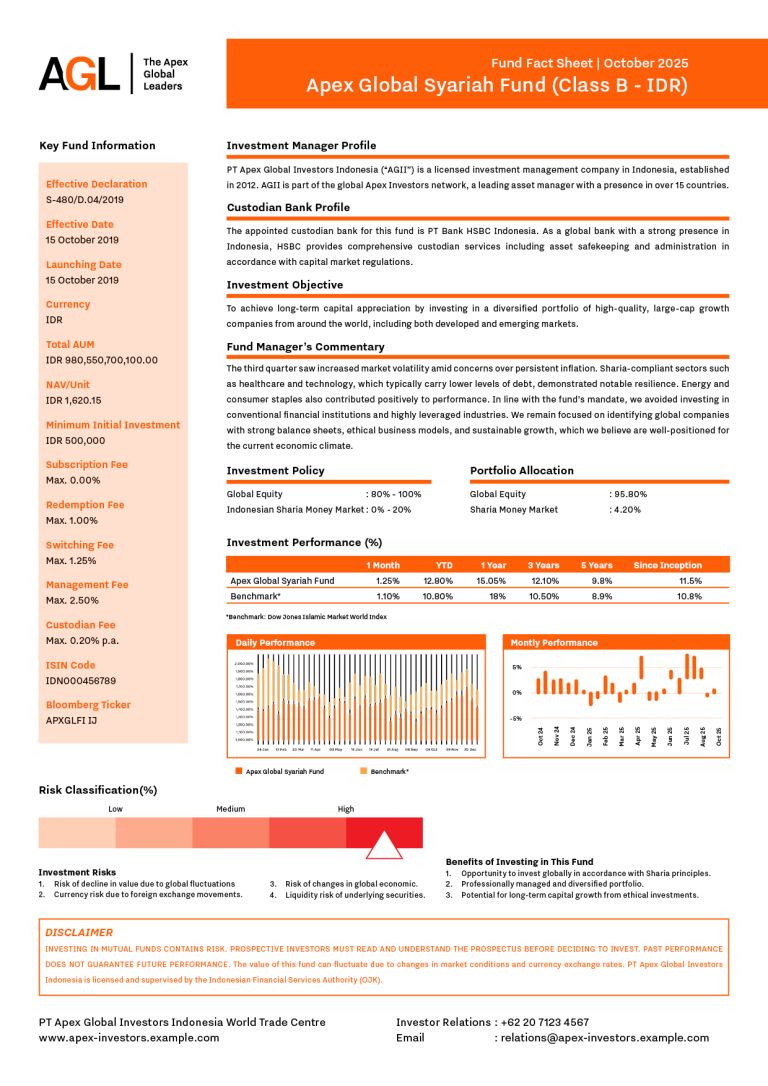
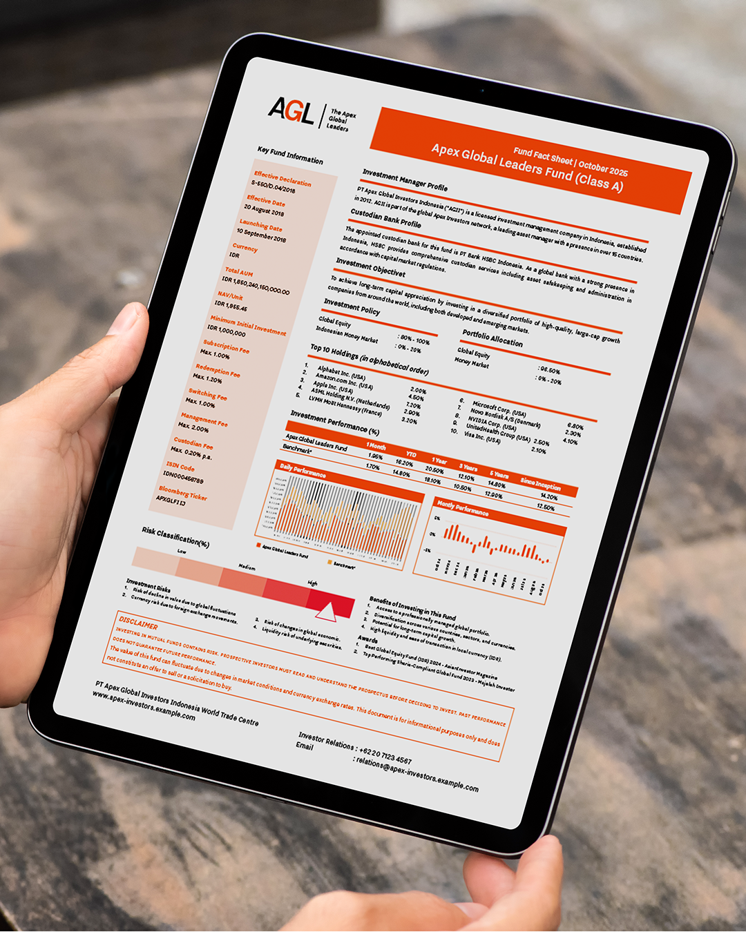
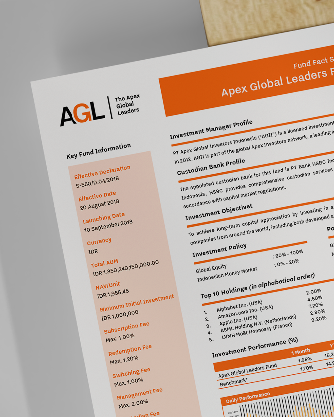
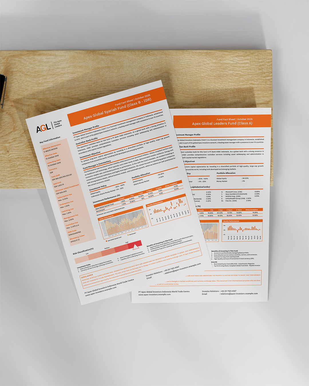
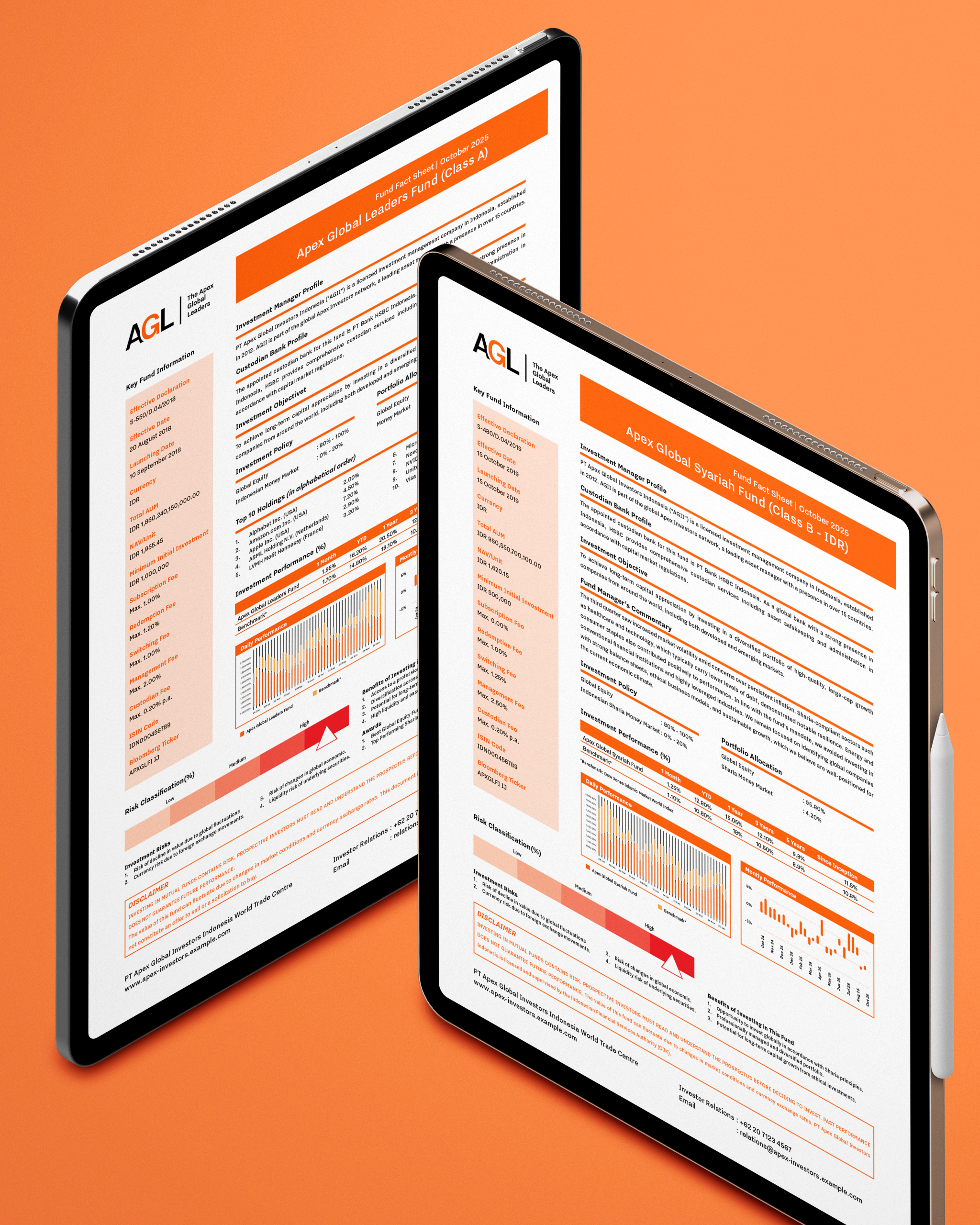
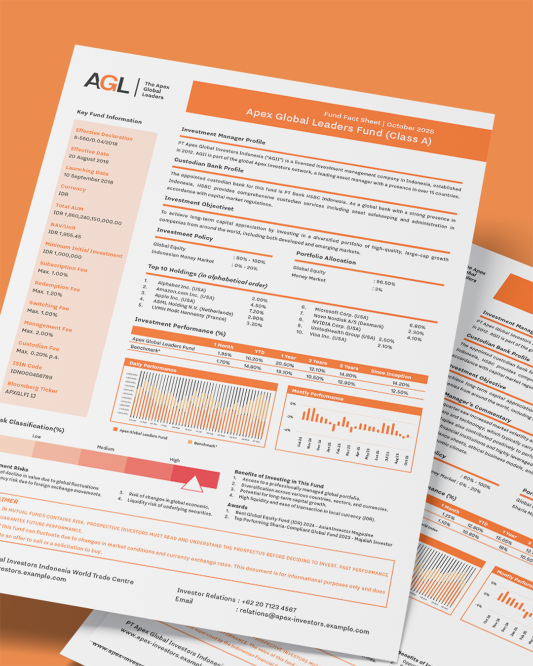
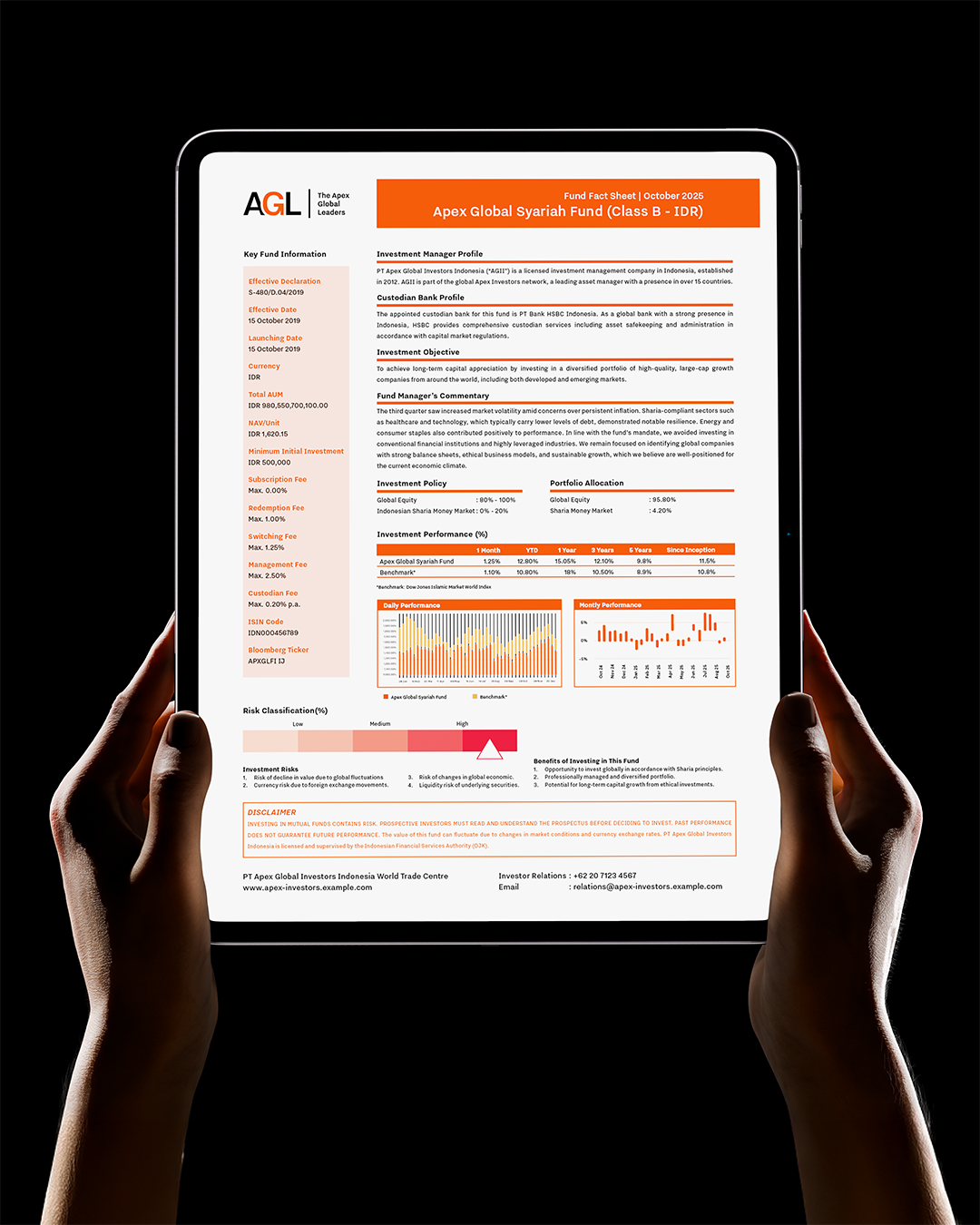
At Alivea, we created a sample fund fact sheet concept using hypothetical data to demonstrate how structure and visual clarity can elevate financial communication. Our goal was to show how a fact sheet can feel professional without being intimidating, and detailed without overwhelming the reader. The layout prioritises hierarchy: investors see the fund’s objective first, followed by performance snapshots, risk level, and asset allocation. Each section is intentionally spaced to guide the eye naturally, reducing cognitive load and making the document easier to scan.
We also explored how colour, typography, and small visual cues can improve understanding. Instead of relying on heavy charts or dense paragraphs, the design uses clean graphs, simplified metrics, and straightforward labels. This keeps the fact sheet friendly for both new investors and experienced professionals. While the data in this sample is fictional, the design approach is practical, it reflects how real-world financial content can be presented in a clearer, more human way. The end result is a one-page layout that feels structured but not overwhelming. It highlights the fund’s strategy, performance, allocation, and features, all in a format that’s easy to digest at a glance.
If you’re looking to refresh your fund materials or want a clean, modern approach to financial communication, our team would love to help. You can reach us anytime at hello@alivea.co to discuss your next project.
- Written by: admin
- Posted on: November 24, 2025