

ESG Data Visualization Singapore For Clearer Sustainability Reports And Decisions
ESG data visualization singapore has become a critical part of modern corporate reporting because sustainability information is now more detailed, more measurable, and more important to stakeholder trust. Companies no longer communicate ESG performance only through long written statements. They need to present emissions data, energy use, workforce metrics, safety performance, diversity indicators, governance structures, climate risks, supplier practices, and target progress in formats that are easy to read, compare, and understand.
For Singapore corporates, effective ESG data design helps transform technical information into meaningful communication. Sustainability reporting often involves multiple departments, including finance, human resources, operations, procurement, legal, risk, investor relations, and sustainability teams. Each department may provide different types of data. Without a clear visual structure, the final report can feel heavy, fragmented, or difficult for stakeholders to navigate. Sustainability data visualization solves this by turning raw figures into dashboards, charts, scorecards, timelines, maps, tables, icons, and visual summaries that guide readers through the company’s ESG performance.
This is especially important because Singapore’s reporting environment continues to mature. SGX explains that sustainability reports should include primary components such as material ESG factors, climate-related disclosures, policies, practices, performance, targets, reporting framework, and board statement. These components require both narrative explanation and measurable evidence. Strong ESG reporting graphics help stakeholders see how a company is performing instead of forcing them to interpret dense text alone.
Professional ESG data storytelling also improves credibility. A chart should not only look attractive. It should help readers understand what changed, why it changed, what the company is doing about it, and how the result connects to broader sustainability goals. For brands such as alivea and corporates seeking premium ESG communication, data visualization is not decoration. It is a strategic reporting tool that supports transparency, readability, investor confidence, internal accountability, and long-term brand trust.
When ESG data visualization Singapore is handled professionally, sustainability reports become clearer, more engaging, and more decision-useful. The report becomes a bridge between complex corporate data and stakeholder understanding.
ESG Data Visualization Singapore For Transparent And Measurable Reporting
ESG data visualization Singapore helps companies present sustainability information in a way that is transparent, measurable, and easier to verify. Many ESG reports include large volumes of data, but not all data automatically creates understanding. A table filled with numbers may be accurate, yet readers may still struggle to see trends, risks, or progress. Good visualization gives structure to the information, allowing stakeholders to identify what matters most and how the company is moving over time.
A strong ESG report should show performance clearly. For example, environmental sections may include greenhouse gas emissions, electricity consumption, water withdrawal, waste diversion, renewable energy usage, and resource efficiency improvements. Social sections may present employee headcount, training hours, safety incidents, diversity indicators, retention data, community contributions, and customer-related metrics. Governance sections may include board composition, policy coverage, ethics training, risk management processes, whistleblowing channels, supplier screening, and compliance outcomes. ESG data design helps each category appear in a consistent and reader-friendly format.
Singapore’s sustainability reporting requirements also make transparent data presentation more important. ACRA states that all listed companies must continue reporting Scope 1 and Scope 2 greenhouse gas emissions from financial years beginning on or after 1 January 2025, while Straits Times Index constituents continue with other ISSB-based climate-related disclosures from FY2025 and Scope 3 greenhouse gas emissions from FY2026. Because climate data can be technical, sustainability data visualization can help companies explain emissions boundaries, year-on-year changes, reduction plans, and target progress more clearly.
ESG reporting graphics should make data easier to understand without oversimplifying important details. Every chart should have a clear purpose. A bar chart may compare annual emissions. A line chart may show energy trends. A progress tracker may show target status. A matrix may explain material ESG topics. A governance diagram may show accountability across board and management levels.
Professional ESG data storytelling connects these visuals to explanation. Readers should not only see the numbers; they should understand the business context. This makes ESG reports more trustworthy and more useful for investors, employees, customers, regulators, and business partners.

ESG Data Design For Reliable, Readable, And Stakeholder-Friendly Reports
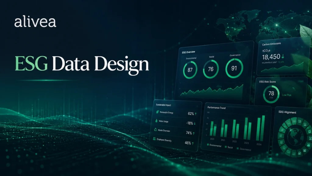
ESG data design is the discipline of arranging sustainability information so that readers can understand it quickly and accurately. It involves more than choosing chart colours or creating decorative icons. It requires information hierarchy, visual consistency, data integrity, accessibility, and strategic communication. In professional ESG reporting, design decisions can influence whether stakeholders understand a company’s progress or feel overwhelmed by the report.
The first principle of ESG data design is clarity. Each visual should answer one main question. How much has emissions performance changed? Which ESG topics are most material? What percentage of employees received training? How close is the company to its sustainability target? Which governance bodies are responsible for ESG oversight? If a visual tries to answer too many questions at once, it may create confusion instead of insight.
The second principle is consistency. Sustainability data visualization works best when charts, labels, legends, icons, typography, spacing, and colours follow a unified system. If every section uses a different style, the report may feel unprofessional. A consistent visual language helps readers move from environmental data to social metrics and governance information without relearning the design system on every page.
The third principle is accuracy. ESG reporting graphics should never distort the meaning of data. Scales should be honest, units should be visible, comparisons should be fair, and captions should explain important limitations. If a chart shows improvement, readers should know whether the improvement reflects operational performance, data scope changes, methodology updates, or business volume differences. ESG data storytelling must support truth, not exaggeration.
IFRS S2 focuses on climate-related risks and opportunities that are useful to users of general purpose financial reports when making resource allocation decisions. This reinforces why ESG data design needs to be decision-useful. Investors and other stakeholders may use sustainability information to evaluate risk, resilience, governance quality, and future business readiness.
For alivea-style premium corporate reporting, ESG data visualization Singapore should combine professional design with reporting discipline. The goal is to make complex sustainability information simple enough to read, but not so simplified that important context disappears. Good ESG data design turns numbers into knowledge and knowledge into trust.
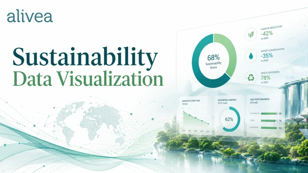
Sustainability Data Visualization For Environmental, Social, And Governance Metrics
Sustainability data visualization helps companies explain performance across environmental, social, and governance areas in a balanced way. ESG reporting is broad, and each category requires different visual treatment. Environmental data may need trend charts and emissions breakdowns. Social data may need demographic visuals, participation rates, safety indicators, and training summaries. Governance data may need process diagrams, responsibility maps, policy dashboards, and risk control tables. A single visual style cannot solve every reporting need.
Environmental visualization is often the most technical. Companies may need to show Scope 1, Scope 2, and Scope 3 emissions, energy intensity, water usage, waste streams, recycling rates, renewable energy adoption, and climate-related targets. ESG data visualization Singapore can make these metrics clearer by separating absolute values from intensity figures, showing historical trends, and explaining baselines. This helps readers see whether improvements are linked to real efficiency gains, business growth, or reporting boundary changes.
Social visualization should communicate people-related information with care. Workforce diversity charts, safety performance tables, training dashboards, employee engagement summaries, and community impact visuals should be clear and respectful. They should avoid reducing people to decorative statistics. ESG data design can use strong visual hierarchy to explain workforce development, wellbeing initiatives, talent investment, inclusion efforts, and community programmes in a way that feels human and credible.
Governance visualization can make complex oversight structures easier to understand. Board responsibilities, committee roles, management reporting lines, risk management steps, ethics training, supplier screening, and compliance channels can be shown through diagrams and structured tables. ESG reporting graphics are valuable here because governance topics can otherwise become dense and abstract.
Sustainability data visualization also improves cross-category understanding. A company may want to show how governance supports climate action, how employee training supports safety performance, or how supplier engagement supports environmental and social responsibility. ESG data storytelling helps link these points so the report feels connected rather than divided into separate sections.
A strong report should not overload readers with visuals. The best visuals are selected because they clarify key messages. When used with discipline, sustainability data visualization helps stakeholders understand performance, compare progress, and trust the company’s reporting journey.
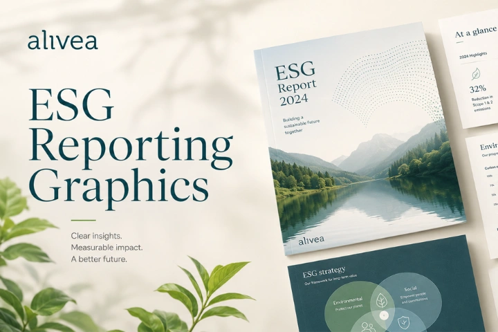
ESG Reporting Graphics For Better Report Navigation And Reader Engagement
ESG reporting graphics play an important role in making sustainability reports easier to navigate. A corporate ESG report can include dozens of sections, hundreds of data points, multiple stakeholder messages, and several layers of disclosure. Without visual structure, readers may skip important information or misunderstand the company’s performance. Graphics help guide attention, organize content, and create a smoother reading experience.
One common use of ESG reporting graphics is the executive summary dashboard. This page can highlight key ESG metrics, major achievements, priority topics, and future targets. A well-designed dashboard allows busy stakeholders to understand the report’s main points before reading the full document. It should not replace detailed disclosure, but it can help readers decide where to go next.
Another useful format is the performance scorecard. Scorecards can show progress against targets, baseline years, current-year results, and future commitments. They are especially helpful when a company tracks several sustainability goals. ESG data visualization Singapore can make scorecards more effective by using clear status labels, concise explanations, and consistent measurement units.
Materiality matrices are also common in ESG reports. They help show which topics are most important to the company and stakeholders. However, a materiality graphic should be supported by narrative explanation. Readers need to understand how topics were selected, who was consulted, and what the results mean for strategy. ESG data storytelling strengthens the graphic by connecting it to decision-making.
Process graphics can explain governance, data collection, risk management, stakeholder engagement, and reporting workflows. These visuals are useful because many ESG processes are complex. A simple diagram can make board oversight or sustainability governance easier to understand than several long paragraphs.
For premium sustainability data visualization, every graphic should support a communication purpose. Decorative shapes, random icons, or unnecessary illustrations can weaken credibility if they distract from the data. A good ESG reporting graphics system balances visual appeal with evidence-based reporting. It makes the document more engaging while keeping the reader focused on accurate sustainability information.
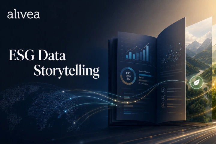
ESG Data Storytelling For Turning Metrics Into Meaningful Business Insights
ESG data storytelling is the process of turning sustainability metrics into meaningful business insights. Data alone can show what happened, but storytelling helps explain why it matters. In corporate ESG reporting, this is essential because stakeholders do not only want numbers. They want to understand the company’s direction, accountability, challenges, and future plans.
A strong ESG data story usually begins with a clear message. For example, a company may want to show that energy efficiency investments reduced electricity consumption, that safety training lowered incident rates, or that supplier engagement improved responsible sourcing coverage. Once the message is clear, the data visualization should support that message with evidence. The narrative should then explain the context, action, result, and next step.
ESG data visualization Singapore becomes more powerful when visuals and writing work together. A chart may show a decrease in emissions intensity, while the supporting text explains operational changes, business growth, facility upgrades, or methodology adjustments. A workforce dashboard may show training improvements, while the narrative explains how the programme supports employee capability and service quality. A governance diagram may show reporting lines, while the text explains how oversight improves accountability.
Good ESG data storytelling also acknowledges complexity. Not every metric improves every year. Some figures may rise because the company expanded operations or improved measurement coverage. Some targets may be delayed because of supply chain challenges, technology limitations, or changing business conditions. Honest storytelling can strengthen trust because it shows that the company is not hiding difficult information.
IFRS S1 and IFRS S2 are designed to guide sustainability-related financial disclosures and climate-related disclosures, helping companies provide information that is useful to users of general purpose financial reports. This aligns with the purpose of ESG data storytelling: making sustainability information useful for decisions.
For alivea and corporates that want strong stakeholder communication, ESG data storytelling can turn technical sustainability data into a clear corporate narrative. It makes reports more engaging, more transparent, and more valuable for business communication.
ESG Dashboard Design For Executive Summaries And Fast Report Scanning
ESG dashboard design is one of the most effective ways to improve report readability because many stakeholders need a fast overview before reading detailed sections. Executives, investors, board members, customers, and business partners may not study every page of a sustainability report immediately. A dashboard gives them a concise snapshot of performance, progress, and priorities.
A strong ESG dashboard should not try to include every metric. It should highlight the most important figures and direct readers to deeper information. Common dashboard elements include emissions performance, energy use, employee training hours, safety results, diversity indicators, community investment, supplier screening, board governance, and target status. ESG data visualization Singapore can arrange these elements into clear metric cards, mini charts, icons, and short explanatory notes.
The most important dashboard design principle is prioritization. If every number is treated as equally important, the reader may not know where to focus. ESG data design should create hierarchy by using section labels, grouping, spacing, and clear data categories. Environmental, social, and governance metrics can be separated or connected depending on the report’s strategy.
Dashboards also support year-on-year comparison. A reader should be able to see whether performance improved, declined, or remained stable. Where possible, the dashboard can show current-year results against previous-year figures or targets. Sustainability data visualization should make these comparisons easy without overcrowding the page.
A premium dashboard may also include brief commentary. A number without context can be misleading. For example, higher emissions may reflect business expansion, while lower energy use may reflect efficiency projects or reduced activity. ESG data storytelling helps explain the meaning behind dashboard figures and prevents oversimplification.
For Singapore corporates, dashboards can also support internal accountability. The same metrics shown in the ESG report can be used in management updates, board meetings, and investor presentations. This makes ESG reporting graphics useful beyond publication. When designed well, dashboards become a practical bridge between reporting, management review, and stakeholder communication.
Climate Data Visualization For Emissions, Risks, And Transition Planning
Climate data visualization is increasingly important because climate-related reporting involves technical data, business risks, and future transition planning. Companies need to explain greenhouse gas emissions, energy performance, climate-related risks, mitigation actions, and targets in a way that stakeholders can understand. Poor visual presentation can make climate information confusing, while strong ESG data design can make the same information clearer and more useful.
Emissions reporting often includes Scope 1 and Scope 2 data, and in some cases Scope 3 data. These categories can be difficult for non-specialist readers. Sustainability data visualization can help by using simple breakdown charts, boundary explanations, emissions source diagrams, and trend comparisons. A report may show direct emissions, purchased energy emissions, and value chain emissions in separate sections, with notes explaining what each category includes.
Climate risk visualization can also improve understanding. Companies may need to explain physical risks, transition risks, policy risks, market shifts, technology changes, and climate-related opportunities. ESG reporting graphics can show these risks through heat maps, risk matrices, scenario timelines, or value chain diagrams. The goal is not to make the report visually dramatic, but to make complex issues easier to evaluate.
ACRA’s timeline shows that Singapore-listed companies must report Scope 1 and Scope 2 greenhouse gas emissions from FY2025, while specific additional ISSB-based climate disclosure requirements follow phased timelines depending on company category. This makes climate visualization valuable because companies must communicate technical data in a structured and responsible way.
Transition planning also benefits from ESG data storytelling. A company may show a roadmap for energy efficiency, renewable energy sourcing, supplier engagement, fleet improvement, low-carbon products, or operational adaptation. A timeline can help readers understand near-term actions, medium-term milestones, and longer-term ambitions.
Climate visuals should always be paired with careful wording. If data boundaries are still developing, the report should say so. If targets are aspirational, the report should explain the basis and action plan. Strong climate data visualization supports transparency, not overstatement.
Materiality Matrix Design For Clear ESG Priorities And Stakeholder Insight
A materiality matrix is one of the most recognizable forms of sustainability data visualization, but it must be designed thoughtfully to be useful. Its purpose is to show which ESG topics are most important to the company and its stakeholders. When done well, a materiality matrix helps readers understand why the report focuses on certain issues and how those issues connect to strategy.
Materiality matrix design begins with clear topic definition. The topics shown in the visual should be specific enough to be meaningful. Broad labels such as “environment,” “people,” or “governance” may not give enough detail. More useful topics may include climate resilience, energy management, employee development, workplace safety, responsible sourcing, customer privacy, business ethics, board oversight, and community engagement.
The next design consideration is axis clarity. Many materiality matrices compare stakeholder importance with business impact, but the exact meaning of each axis should be explained. ESG data design should avoid creating a visual that looks impressive but leaves readers unsure about how topics were evaluated. Supporting text should describe the engagement process, assessment method, and key findings.
A strong matrix should also avoid visual clutter. Too many topic labels can make the graphic difficult to read. Grouping topics by environmental, social, and governance categories can help. Colour coding may be useful, but it must be accessible and consistent with the rest of the report. ESG reporting graphics should improve comprehension, not create decoration.
Materiality visuals are especially useful when connected to report structure. If a topic appears as highly material, the report should discuss how the company manages it, what metrics are tracked, and what progress has been made. ESG data storytelling turns the matrix into a strategic guide rather than a standalone graphic.
For Singapore corporates, materiality matrix design also supports stakeholder confidence. It shows that sustainability priorities were not selected randomly. They were identified through a process. When this process is visualized clearly, readers can better understand the company’s ESG focus and reporting logic.
Workforce Data Visualization For Social Performance And Human Impact
Workforce data visualization helps ESG reports communicate social performance in a more accessible and meaningful way. Many companies have detailed human capital information, but long paragraphs about people initiatives can feel generic if they are not supported by clear data. ESG data visualization Singapore can help present workforce metrics with structure, balance, and human context.
Common workforce visuals include employee demographic charts, training hour dashboards, diversity indicators, safety performance tables, retention trend graphs, engagement summaries, and leadership development participation. These visuals can help stakeholders understand how a company supports its people and manages social responsibility. However, the design should be respectful and accurate. Social data represents people, not only statistics.
ESG data design should distinguish between numbers that describe workforce composition and numbers that show performance outcomes. For example, headcount by function is different from employee engagement results. Training participation is different from training effectiveness. Safety incident rates are different from safety culture maturity. A clear visual system helps readers understand these differences.
Sustainability data visualization should also include context. If training hours increased, what type of training drove the change? If workplace incidents decreased, what safety initiatives contributed? If diversity improved, what recruitment or leadership practices supported the shift? ESG data storytelling adds meaning to the visuals and prevents the report from becoming a simple data catalogue.
Workforce visuals can also support employer branding. Employees and job candidates may read ESG reports to understand company culture, values, development opportunities, and workplace responsibility. Clear ESG reporting graphics can make these themes more visible. At the same time, content must remain honest. Overly polished people visuals can feel insincere if not supported by real action.
For alivea-style corporate reporting, workforce data visualization should combine professionalism with empathy. It should communicate social performance in a way that is credible, readable, and aligned with the company’s broader sustainability narrative.
Governance Data Graphics For Oversight, Ethics, And Accountability
Governance data graphics help explain how ESG responsibilities are managed inside the company. Governance sections are often text-heavy because they involve board oversight, committee structures, policies, risk management, compliance procedures, ethics controls, and reporting responsibilities. Visuals can make these topics easier to understand and more engaging for stakeholders.
A governance structure diagram can show how the board, senior management, sustainability committee, risk team, operational departments, and reporting functions interact. This helps readers see where accountability sits. ESG data visualization Singapore can use clean hierarchy diagrams, process flows, and responsibility maps to simplify complex governance relationships.
Policy dashboards are also useful. A company may want to show coverage across anti-corruption, whistleblowing, data protection, supplier conduct, workplace safety, diversity, and environmental management. Instead of describing every policy in long paragraphs, ESG reporting graphics can present policy areas, ownership, training coverage, review status, and implementation highlights in a structured format.
Risk management visuals can show how ESG risks are identified, assessed, escalated, monitored, and reviewed. These graphics are valuable because ESG risks often cut across departments. A visual process can help stakeholders understand how the company manages sustainability issues in practice.
Governance data should not be presented as decoration. ESG data design must ensure that charts and diagrams match actual governance structures. If the board reviews ESG annually, the report should not imply continuous oversight unless that is accurate. If management responsibility is still developing, the visual should reflect current practice while explaining improvement plans.
ESG data storytelling strengthens governance content by showing why oversight matters. Governance is not only a compliance section. It explains how the company protects integrity, manages risks, makes decisions, and supports sustainable value creation. When governance visuals are clear and honest, they improve confidence in the entire ESG report.
Digital ESG Data Visualization For Online Reports And Investor Pages
Digital ESG data visualization is becoming more important because stakeholders increasingly access sustainability information through websites, investor relations pages, online reports, and downloadable PDFs. A printed-style report alone may not be enough. Companies need ESG data that can be viewed on screens, shared across platforms, and adapted for different communication channels.
Digital visuals should be designed for readability. A complex chart that works on a large desktop page may not work well on mobile. ESG data design for digital channels should consider responsive layouts, readable typography, simplified labels, accessible contrast, and clear navigation. Interactive dashboards can be useful, but they should not sacrifice accuracy or accessibility.
Online sustainability data visualization can help stakeholders find information quickly. For example, a company website may feature ESG highlights, emissions trends, target progress, workforce metrics, governance structure, and downloadable reports. These visuals can guide readers to deeper sections while giving immediate insight. ESG reporting graphics can also support investor presentations, social posts, recruitment materials, and internal updates.
Search visibility is another benefit. When ESG data is explained through structured web content, companies can improve discoverability for relevant sustainability topics. Keywords such as esg data visualization singapore, esg data design, sustainability data visualization, esg reporting graphics, and esg data storytelling can be used naturally in headings and supporting copy. The goal is not keyword stuffing. The goal is to make helpful ESG information easier to find and understand.
Digital ESG data storytelling should remain consistent with the approved report. Figures used on websites, social media, and investor materials should match the official disclosure unless clearly updated and explained. If a company simplifies data for an infographic, the simplified version should not change the meaning.
For companies such as alivea and corporate brands investing in premium communication, digital visualization extends the value of ESG reporting beyond the annual document. It helps sustainability information become more accessible, reusable, and engaging across stakeholder channels.
ESG Infographic Design For Simplifying Complex Sustainability Topics
ESG infographic design can help companies explain complex sustainability topics in a concise and engaging way. Infographics are useful when a topic involves multiple steps, relationships, categories, or outcomes. They can simplify information such as emissions sources, stakeholder engagement processes, sustainability strategy pillars, circular economy initiatives, community impact programmes, or responsible supply chain workflows.
A good ESG infographic begins with a clear purpose. It should not simply compress a long paragraph into a colourful layout. It should help the reader understand something faster. For example, an infographic can show how the company collects ESG data across departments, how sustainability governance flows from board to operations, or how waste reduction initiatives move from source separation to recycling outcomes.
ESG data visualization Singapore should keep infographics focused. Too many icons, arrows, and labels can make a graphic harder to understand. ESG data design should use logical sequencing, clean spacing, concise wording, and consistent visual cues. The reader should be able to understand the main message within a few seconds, then review details if needed.
Sustainability data visualization through infographics can also support non-technical audiences. Not every stakeholder understands ESG terminology. A simple visual explanation of Scope 1 and Scope 2 emissions, materiality assessment, climate risk categories, or supplier screening can make the report more inclusive and useful.
However, ESG reporting graphics must stay accurate. Infographics should not oversimplify sensitive topics such as emissions performance, human rights, governance controls, or risk exposure. If a topic requires limitations or methodology notes, the infographic should be supported by captions or nearby explanatory text.
ESG data storytelling works well with infographics because it helps connect visual explanation to business meaning. For alivea-style corporate reporting, infographics can make ESG reports feel premium, modern, and reader-friendly while maintaining professionalism and disclosure integrity.
Alivea Approach To ESG Data Design For Premium Corporate Reporting
An alivea-style approach to ESG data visualization Singapore can help companies turn sustainability information into a premium reporting experience. The objective is not simply to make reports look more attractive. The objective is to make ESG information more useful, more readable, and more credible for stakeholders who need to understand performance and strategy.
The process should begin with content and data review. Before creating visuals, the design team should understand the company’s ESG priorities, reporting framework, available metrics, target structure, stakeholder needs, and brand identity. This prevents visuals from becoming disconnected from the report’s actual message. ESG data design should always begin with information, not decoration.
The next step is visual system development. A professional report needs a consistent approach to charts, tables, icons, dashboards, timelines, matrices, and section summaries. Sustainability data visualization should look connected across the whole report. This creates a stronger reader experience and improves brand consistency.
Alivea-style ESG reporting graphics can also emphasize clarity and premium simplicity. Instead of using overly complex visuals, the report can use elegant data cards, refined chart layouts, structured tables, and clean infographic systems. The visual tone should support corporate trust. A polished report should feel professional, but the data must remain the focus.
ESG data storytelling is then used to connect visuals with meaning. Each visual should be supported by concise explanation that tells readers what the data shows, why it matters, and what the company is doing next. This makes the report more helpful and less mechanical.
For corporates, this approach can improve stakeholder engagement, investor communication, board reporting, internal alignment, and public trust. A premium ESG report is not defined by design complexity. It is defined by how effectively it turns sustainability information into clear, responsible, and credible communication.
ESG Visualization Workflow For Data Collection, Design, And Review
A reliable ESG visualization workflow helps companies avoid errors, inconsistencies, and last-minute design problems. Data visualization should not happen only at the end of report production. It should be built into the reporting process from the beginning, because the quality of visuals depends on the quality of data, definitions, and content planning.
The first stage is data identification. The company decides which metrics should be visualized and why. Not every number deserves a chart. ESG data visualization Singapore should focus on information that supports stakeholder understanding, such as trends, comparisons, target progress, topic importance, process flow, or governance accountability.
The second stage is data validation. Before visuals are designed, data owners should confirm figures, units, reporting boundaries, calculation methods, and source documents. ESG data design depends on reliable inputs. If numbers change after layout completion, the design process becomes inefficient and riskier.
The third stage is visualization selection. A bar chart, line chart, table, scorecard, map, matrix, timeline, or infographic should be chosen based on the message. Sustainability data visualization works best when the format matches the data type. Trends need time-based visuals. Comparisons need side-by-side structures. Processes need flows. Priorities may need matrices or grouped cards.
The fourth stage is narrative integration. ESG reporting graphics should be placed near the text that explains them. Readers should not have to search for meaning. ESG data storytelling should describe the insight, business context, and next action.
The final stage is review. Sustainability, finance, legal, communications, and management teams may need to check visuals before publication. They should confirm that the graphics are accurate, balanced, and consistent with approved disclosure. A strong workflow makes ESG reports more efficient, professional, and trustworthy.
Avoiding ESG Visualization Mistakes That Reduce Reporting Credibility
Even well-intentioned ESG reports can lose credibility when data visualization is poorly executed. One common mistake is using visuals that look impressive but do not explain anything. Decorative charts, unnecessary icons, and overdesigned pages can distract readers from the actual data. ESG data visualization Singapore should support understanding, not visual noise.
Another mistake is using inconsistent scales or unclear units. If one chart shows energy in kilowatt-hours and another uses megawatt-hours without explanation, readers may become confused. If emissions figures are presented without defining Scope 1, Scope 2, or reporting boundaries, the visual may create more questions than answers. ESG data design should always make units, labels, and boundaries visible.
A third mistake is cherry-picking favourable data. If a company highlights only improved metrics and hides weaker areas, stakeholders may question the report’s balance. ESG reporting graphics should support fair communication. Positive achievements can be shown clearly, but challenges and improvement plans should also be addressed.
Overcrowding is another issue. Some reports try to place too much information on one page. A materiality matrix with too many labels, a dashboard with too many metrics, or a table with too many columns can reduce readability. Sustainability data visualization should simplify the reading path while preserving important context.
Poor narrative support is also a problem. A chart without explanation may leave readers guessing. ESG data storytelling should tell readers what the visual means and why it matters. This is especially important when performance changes are caused by business growth, methodology updates, acquisition activity, or new measurement boundaries.
By avoiding these mistakes, companies can produce ESG reports that feel more professional, transparent, and useful. Strong visualization protects credibility because it respects the reader and the data. Start here trusted esg report agency singapore for professional reporting design.
What Is ESG Data Visualization Singapore In Corporate Sustainability Reports?
ESG data visualization Singapore refers to the process of turning sustainability information into clear visual formats for corporate reports, websites, investor materials, and stakeholder communication. It includes charts, dashboards, tables, scorecards, infographics, diagrams, materiality matrices, timelines, and performance summaries.
The purpose is to make ESG information easier to understand. Many sustainability reports contain complex data about emissions, energy, waste, employees, safety, governance, suppliers, and climate risks. Without strong ESG data design, this information may feel too technical or disconnected. Sustainability data visualization helps readers see patterns, compare performance, and understand progress more quickly.
Professional ESG reporting graphics also support trust. They make important data easier to review and reduce the risk of unclear interpretation. ESG data storytelling then connects visuals with business meaning, explaining why the numbers matter and what actions the company is taking. For corporates, strong visualization can improve report readability, stakeholder engagement, and overall communication quality.
Who Needs ESG Data Design For Clearer Sustainability Communication?
ESG data design is useful for listed companies, private enterprises, multinational corporations, investor-facing businesses, sustainability teams, annual report teams, and corporate communications departments. Any company that collects ESG information and needs to explain it clearly can benefit from professional data visualization.
Sustainability managers often need ESG data visualization Singapore support because they handle many metrics from different departments. Investor relations teams may need clear charts to explain performance and risk. Human resources teams may need visuals for workforce and training data. Operations teams may need environmental dashboards, while governance teams may need diagrams that explain oversight and accountability.
Professional sustainability data visualization is also valuable for companies preparing more mature ESG reports. As reporting requirements become more data-driven, stakeholders expect figures to be presented clearly and consistently. ESG reporting graphics and ESG data storytelling help convert raw numbers into useful communication. This makes reports easier to read, easier to compare, and more credible.
Where Should Sustainability Data Visualization Appear In ESG Reports?
Sustainability data visualization should appear wherever data needs to be understood quickly and accurately. It is especially useful in executive summaries, environmental sections, workforce pages, governance chapters, materiality discussions, climate disclosure areas, target progress pages, and appendices.
In the executive summary, ESG data visualization Singapore can highlight key metrics and achievements. In environmental sections, ESG data design can show emissions, energy, water, waste, and climate trends. In social sections, visuals can explain employee training, safety, diversity, and community impact. In governance sections, ESG reporting graphics can map board oversight, policies, risk controls, and accountability processes.
Sustainability data visualization can also appear beyond the PDF report. Companies can adapt visuals for websites, investor relations pages, presentations, internal dashboards, LinkedIn content, and stakeholder briefings. ESG data storytelling should accompany these visuals so the message remains clear across every channel. The best placement depends on the audience, the purpose of the data, and the level of detail required.
When Should ESG Reporting Graphics Be Created During Report Development?
ESG reporting graphics should be planned early in the reporting process, not only after the content has been written. Early planning helps teams decide which data should be visualized, which charts are needed, what information is missing, and how visuals will fit into the report structure.
If graphics are created too late, the design team may discover that data is incomplete, definitions are unclear, or the selected visual format does not match the available information. Early ESG data visualization Singapore planning helps prevent these issues. It also allows writers, designers, sustainability teams, and data owners to work together.
ESG data design should begin after key metrics and material topics are identified, but before final layout production. Sustainability data visualization can then be integrated naturally into the report. ESG data storytelling should be developed alongside the graphics, so each visual has clear explanation. This creates a smoother workflow and a stronger final ESG report.
Why Does ESG Data Storytelling Matter For Stakeholder Confidence?
ESG data storytelling matters because stakeholders need to understand the meaning behind sustainability metrics. A chart can show that performance changed, but it may not explain why the change happened or what the company plans to do next. Storytelling adds context, accountability, and strategic meaning.
For example, emissions may increase because the business expanded, or they may decrease because energy efficiency improved. Training hours may rise because the company invested in new capability programmes. Supplier screening coverage may improve because procurement controls were strengthened. ESG data visualization Singapore shows the information, while ESG data storytelling explains the significance.
Stakeholder confidence grows when companies present data honestly and clearly. Sustainability data visualization should not hide weak performance. ESG reporting graphics should support balanced communication by showing progress, challenges, and targets. ESG data design and storytelling together help readers trust that the company understands its sustainability performance and is managing it responsibly.
How Can Companies Improve ESG Data Visualization Singapore Effectively?
Companies can improve ESG data visualization Singapore by starting with reliable data, clear objectives, and a consistent visual system. The first step is to decide what each visual must communicate. A chart should answer a specific question, such as whether emissions decreased, whether targets are on track, or which ESG topics are most material.
The second step is choosing the right format. ESG data design should match the data type. Trends need line charts, comparisons need bar charts, complex processes need diagrams, and target progress may need scorecards. Sustainability data visualization should also include clear labels, units, legends, captions, and methodology notes where needed.
The third step is integrating ESG data storytelling. Every important visual should be supported by concise explanation. ESG reporting graphics should help readers understand what changed, why it matters, and what comes next. Companies should also review visuals carefully before publication to ensure accuracy, consistency, and balance. This creates reports that are professional, useful, and trusted.
Building Clearer Corporate Trust Through ESG Data Visualization Singapore
ESG data visualization Singapore is now a major part of effective corporate sustainability reporting. As ESG information becomes more technical, measurable, and important to stakeholder decision-making, companies need better ways to present their data. Long paragraphs and dense tables are no longer enough. Stakeholders need visual communication that helps them understand performance, compare progress, evaluate governance, and see future direction clearly.
Strong ESG data design brings structure to complex information. It helps companies present emissions, energy use, water consumption, waste performance, workforce development, safety results, diversity indicators, supplier engagement, governance oversight, climate risks, and target progress in a format that is easier to read. Sustainability data visualization also improves report navigation by giving readers dashboards, scorecards, charts, timelines, matrices, and infographics that guide attention.
ESG reporting graphics should always support transparency. They should not decorate weak content or exaggerate results. The best visuals respect the data, explain limitations, and support honest communication. ESG data storytelling then adds business meaning by explaining what the numbers show, why they matter, and how the company is responding. This combination of visual clarity and narrative context builds stronger stakeholder confidence.
For companies such as alivea and corporates seeking premium ESG communication, professional visualization can transform a sustainability report from a formal document into a strategic communication asset. It can support investor relations, employee engagement, customer trust, board reporting, website visibility, and brand reputation. It also helps internal teams see ESG progress more clearly and manage future improvements with better insight.
Ultimately, ESG data visualization is not only about making reports look modern. It is about making sustainability performance understandable. When companies present ESG data with clarity, accuracy, and purpose, they strengthen corporate trust and create reports that are more impactful, more useful, and more aligned with responsible business growth.
