

Annual Report Design Case Study| Non-Profit | Visual Identity
Most annual reports suffer from a reputation problem. This is the core challenge of non-profit annual report design: transforming a dry statutory requirement into an engaging narrative. For OnePeople.sg, the national body championing racial harmony, a standard ‘corporate’ report simply wasn’t an option. Their 2024/2025 report needed to reflect their spirit of unity, which is precisely what effective non-profit annual report design must achieve. In this annual report design case study, we will showcase you two things: our process as design agency with annual report service and also our strength in visual story telling.
Why design matters for non-profit annual reports?
In the non-profit world, design is a translator. It takes cold hard data (the compliance part) and translates it into impact (the emotional part). A smart layout doesn’t just make a report “pretty”; it makes the financial stewardship transparent and the mission accessible. This translation process is crucial because the currency of any non-profit is trust.
When raw numbers are presented with clear data visualization and thoughtful information hierarchy, it signals meticulous accountability to donors and stakeholders. Effective non-profit annual report design acknowledges that complex information needs to be consumed quickly; readers are often looking for the story behind the figures. Our role is to reduce the friction between the data and the user’s understanding, thereby reinforcing the mission’s credibility and inviting participation, rather than just passive reading.
The Brief: Redefining Non-Profit Annual Report Design
The challenge was straightforward: OnePeople.sg needed an report that didn’t put people to sleep. They wanted a publication that reflected the vibrancy of the communities they serve; youth, educators, and volunteers.
The organization wanted a publication that felt approachable to everyone. Our directive was to transform a corporate obligation into a community celebration. We needed to prove that a document could be serious about data without taking itself too seriously.
The Project Execution
Our process for this report was deliberately linear but highly collaborative. We don’t believe in retrofitting content into pre-made templates. We started from scratch, beginning with a deep dive into the raw content to understand the narrative arc of the year. Before a single pixel was placed, we established the mood and tone. We wanted to ensure the visual language would support the story, not distract from it.
Once the concept was approved, we moved into the structural phase. Designing an annual report is often a game of Tetris; you have to fit fluctuating word counts and financial tables into a cohesive system. We built a custom grid layout that offered flexibility. This allowed us to switch between text-heavy financial pages and image-rich feature stories without the publication feeling disjointed.
Conceptualization
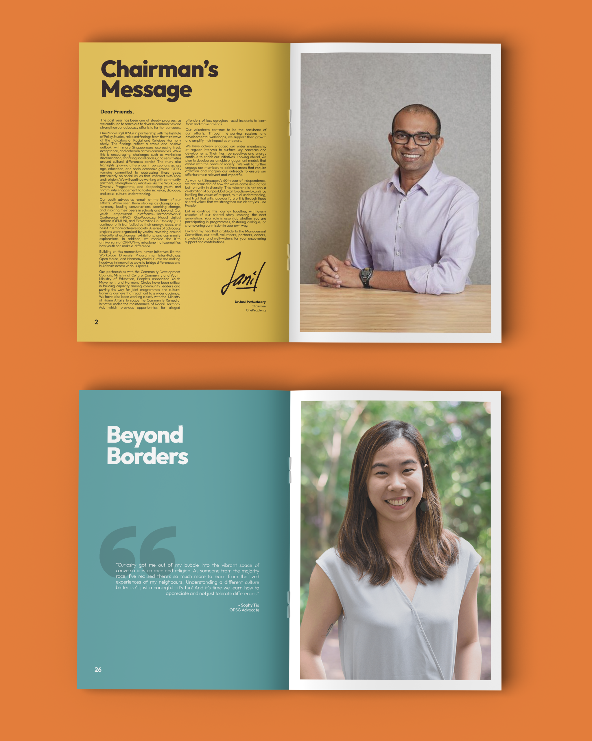
The theme was “Our Shared Story.” The idea is that harmony isn’t a policy; it’s a collection of daily human interactions. The imagery is quiet and optimistic, signaling growth and renewal. To reinforce the human element, we utilized a handwritten script for the title. This wasn’t just an aesthetic choice; it was a signal of authenticity. In a world of rigid corporate fonts, a handwritten title feels personal, like a note from a friend rather than a memo from a boardroom.
The Cover? No stock photos of people shaking hands. We used a hand-drawn illustration of an open book and a sunflower (Shout out to our illustrator for this).
Layout: Organized Chaos (But Mostly Organized)
A report still needs to be readable. We balanced the “quirky” with the “functional.”
The layout phase is where the magic, and the hard work, happens. We meticulously placed every element, ensuring that the “boring” parts (the numbers) were just as legible and well-treated as the “fun” parts (the event photos). The revision stage was less about correcting errors and more about refining the rhythm of the book. We worked closely with the OnePeople.sg team to ensure the pacing felt right, adjusting margins and spacing until the book felt balanced. Finally, once everything align we are ready for the final production!.
Why This Non-Profit Annual Report Design Works
The success of the OnePeople.sg concept as non-profit annual report lies in its refusal to be a boring design. In this annual report design case study, We would like to highlight that effective concept must always root every decision in empathy for the reader. We knew that dense text intimidates people, so we prioritized white space. By giving the content room to breathe, we reduced the cognitive load on the reader, making it easier for them to absorb the information. The wide margins and structured grid provide a sense of calm discipline, which contrasts effectively with the energy of the content.
Furthermore, the decision to prioritize candid photography over staged shots played a massive role in the report’s authenticity. When readers see real laughter, genuine focus, and unscripted interaction, they trust the organization more. We paired this visual honesty with a color palette that felt energetic but not chaotic, anchoring the vibrant orange of their brand with cooler teals and purples. Even the paper choice was intentional; selecting a smooth matte finish added a tactile warmth that a glossy, corporate finish would have lacked. Ultimately, this report works because it treats the reader as a partner in the story, not just a consumer of data. See the design in action. [Read the full OnePeople.sg report here]
Ready to Tell Your Story?
Designing an annual report that people actually read isn’t a last-minute task especially for non-profit annual report design. It requires the kind of empathy, structure, and intentionality we explored with OnePeople.sg. If you want your next report to be a narrative rather than just a requirement, we should talk now. We are an design agency with annual report service, you can contact us through the form below or send a nice email to hello@alivea.co.The December Advantage: To help you end the year on a high note (and get a head start on 2026), we are offering a special rate for projects confirmed in December.