
Annual Report Visual Design Best Practices for Clearer and Stronger Singapore Reports
For Singapore firms, the annual report has become much more than a formal business document prepared at the end of a financial year. It is now a strategic communication tool that shapes perception, strengthens corporate identity, and helps stakeholders understand how the business performs, where it is heading, and what principles guide its decisions. This shift is one reason annual report visual design best practices matter more than ever. A well-designed report does not simply look polished. It improves readability, gives structure to complex information, and supports a more credible presentation of business performance.
The strongest annual reports are designed with both substance and user experience in mind. Investors, board members, regulators, clients, and internal stakeholders all approach reports differently. Some want quick access to performance highlights. Others want deeper explanations, governance detail, or strategic commentary. Good visual design helps each audience find and understand the information that matters to them. That is why the best high impact annual report design is never based on decoration alone. It is grounded in layout discipline, content hierarchy, visual consistency, and clear data presentation.
Singapore firms also need reports that balance professionalism with accessibility. Dense pages, inconsistent charts, poor typography, and cluttered sections can make a report difficult to read, even when the content itself is strong. By contrast, the best business performance report uses thoughtful spacing, clean page flow, strong visual rhythm, and purposeful emphasis to make complex material easier to absorb. Every design choice should help the reader move more confidently through the report.
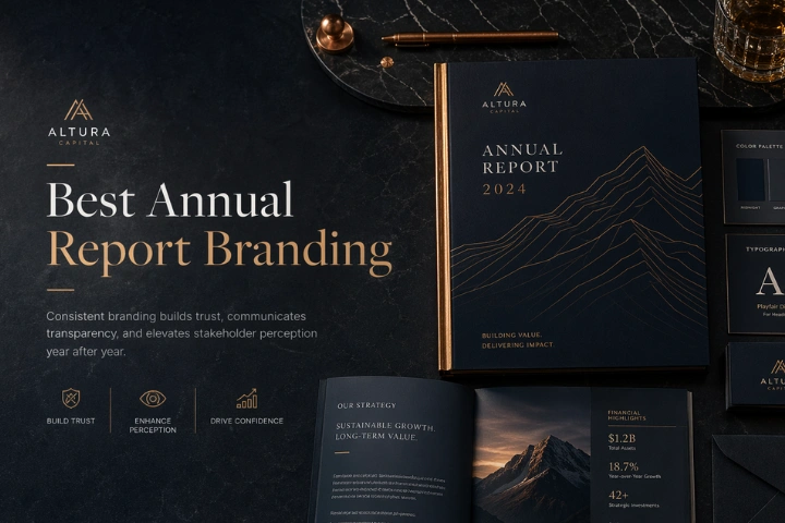
Branding is equally important. The best annual report branding ensures that the publication reflects the company’s identity, tone, and positioning rather than feeling like a generic corporate template. At the same time, the best corporate storytelling report combines visuals and content to guide readers through a meaningful narrative about strategy, results, and future direction. Agencies such as alivea often approach report design as an integrated blend of structure, storytelling, and brand communication.
When visual design is handled well, the annual report becomes more than a record of corporate activity. It becomes a high-value asset that communicates clarity, trust, and leadership maturity. For Singapore firms operating in competitive and reputation-sensitive sectors, those qualities can make a significant difference in how the business is understood.

Annual Report Visual Design Best Practices That Improve Readability and Structure
The most effective annual report visual design best practices begin with clarity. Before a report can appear sophisticated or impactful, it must first be easy to read. Many annual reports fail not because the content is weak, but because the presentation makes important information harder to follow. In Singapore firms, where annual reports often serve both compliance and strategic communication purposes, readability is essential. A visually strong report allows readers to move naturally from one section to another without confusion or fatigue.
One of the most important best practices is establishing a clear visual hierarchy. Headings, subheadings, body text, captions, charts, pull quotes, and key metrics should each have a distinct function and appearance. This helps readers understand which information is primary, which is supportive, and how ideas relate across the page. The best high impact annual report design does not force readers to search for meaning. It leads them through the content with intention.
Grid systems and page consistency are also essential. A strong report uses alignment, spacing, margin control, and structured layouts to create rhythm and order. When page design varies too much from section to section, the report feels unstable. A consistent system supports trust and makes the publication feel professionally managed. This is a core characteristic of the best business performance report, where even highly detailed information remains readable because the design framework holds everything together.
Typography choices also matter greatly. Fonts should be legible, modern, and appropriate to the company’s tone. Overly stylized or poorly spaced typography can reduce clarity. Good reports use typography to build emphasis without overwhelming the reader. This also contributes to the best annual report branding, since type style plays a major role in how brand identity is expressed within a formal document.
Finally, strong structure supports storytelling. The best corporate storytelling report uses visual design to reinforce narrative flow, not interrupt it. Section transitions, chapter openers, summary highlights, and visual pacing all help make the report feel coherent. These annual report visual design best practices are not only technical design choices. They are communication decisions that shape how effectively the company is understood by every stakeholder who reads the report.

Best High Impact Annual Report Design Approaches for Singapore Corporate Reports
The best high impact annual report design is built on focus, precision, and strategic intent. In a Singapore corporate context, impact does not come from excessive visual effects or decorative complexity. It comes from a report’s ability to communicate key information clearly, create a strong impression of professionalism, and help readers remember the company’s most important messages. High-impact design is effective because it highlights what matters most without reducing the seriousness of the report.
A strong approach begins with content prioritization. Not every section deserves equal visual weight. Strategic milestones, financial highlights, operational achievements, transformation initiatives, governance strengths, or sustainability progress should receive deliberate emphasis. This is one reason annual report visual design best practices matter so much. They help design teams shape emphasis through layout hierarchy, graphic treatment, and editorial pacing rather than leaving every page to compete for attention equally.
Impact is also created through visual restraint. The best-designed reports do not overload readers with too many competing colors, styles, illustrations, or dense page elements. Instead, they create contrast where needed and allow whitespace to support clarity. This is a hallmark of the best business performance report, where every visual element serves a purpose. Good impact is controlled, not chaotic.
Another important factor is consistency across the full report. The best annual report branding does not appear only on the cover or introduction pages. It carries through typography, charts, image handling, icons, color language, and messaging tone. When all these elements work together, the report feels more trustworthy and more aligned with the company’s broader communications.
Narrative also plays a major role in impact. The best corporate storytelling report uses design to strengthen the message rather than distract from it. Strategic visuals, chapter openers, timelines, highlighted metrics, and quote features can all help guide readers through the company’s story. When those devices are used carefully, the report feels more dynamic and memorable.
Ultimately, the best high impact annual report design is not defined by visual trendiness. It is defined by how effectively the report communicates confidence, clarity, and corporate maturity. For Singapore firms aiming to improve stakeholder trust and present performance more persuasively, impact should always come from purpose-driven design rather than superficial styling.

Best Business Performance Report Methods for Presenting Corporate Results Clearly
The best business performance report is one that transforms complex results into information that stakeholders can understand quickly and accurately. Annual reports often combine financial outcomes, operational achievements, governance details, market context, and strategic commentary in one publication. Without a thoughtful method of presentation, even strong business results can seem difficult to interpret. For Singapore firms, where stakeholder confidence is closely tied to communication quality, clarity in performance reporting is essential.
A core best practice is to structure performance information around relevance. Instead of overwhelming readers with undifferentiated content, the report should guide them through the most important signals first. Executive summaries, performance dashboards, chapter highlights, and thematic overviews help readers understand the broad picture before diving into detail. This approach aligns with annual report visual design best practices, because the design should support layered reading rather than forcing all information into equal prominence.
Data visualization is another important method. The best high impact annual report design uses charts, graphs, timelines, and metric summaries to explain movement, comparison, and outcome clearly. However, visual data tools must remain disciplined. Overdesigned charts can obscure meaning rather than improve it. Good data presentation emphasizes readability, consistency, labeling accuracy, and visual balance.
Narrative framing also matters. The best corporate storytelling report does not present numbers in isolation. It explains what influenced results, what changed during the year, what leadership learned, and how the company is responding. This makes performance more understandable and more credible. Readers do not simply see what happened. They understand why it happened.
Brand connection should not be ignored either. The best annual report branding ensures that performance reporting still feels aligned with the company’s identity and communication standards. Visual style, tone, and structure should reflect the same professionalism seen in other official business materials. When performance sections feel disconnected from the rest of the report, the publication loses coherence.
Taken together, the best business performance report methods combine structure, visual logic, narrative context, and brand consistency. They help firms present results in a way that is informative without being overwhelming, polished without being superficial, and credible without being difficult to follow. That balance is what makes performance communication truly effective.
Best Annual Report Branding Methods That Strengthen Recognition and Consistency
The best annual report branding methods help a report feel unmistakably connected to the company behind it. Many annual reports contain accurate content and competent layouts, yet still fail to reinforce corporate identity. This often happens when design decisions are made in isolation from the brand system. For Singapore firms that care about professionalism, positioning, and stakeholder trust, branding within the annual report should be intentional, consistent, and well integrated into the publication as a whole.
A strong starting point is visual alignment. This means the annual report should reflect the same brand character found in the company’s website, investor communication, presentations, and official marketing assets. Color systems, typography, image treatment, icon styles, and tone of messaging should feel related rather than disconnected. This is one of the clearest annual report visual design best practices, because consistent branding creates familiarity and helps readers recognize the company more quickly and more confidently.
Branding also influences how impact is created. The best high impact annual report design does not rely on arbitrary visual choices. It uses brand-based logic to create emphasis, rhythm, and distinction. A company known for precision may need a more restrained and structured design language, while a business positioned around innovation may adopt a more dynamic but still disciplined presentation. Either way, the design should feel authentic to the organization.
Branding becomes stronger when connected to performance communication. The best business performance report does not separate financial results from identity. Instead, it presents results in a way that reflects the company’s tone, values, and strategic positioning. Readers then see a more coherent picture of what the business stands for and how it operates.
This also overlaps with storytelling. The best corporate storytelling report uses brand voice to shape how the year is described. Leadership commentary, section framing, case studies, and future-looking statements should all sound like part of the same organization. When that consistency is missing, the report may still function, but it will feel less credible and less memorable.
In practice, the best annual report branding methods do more than improve appearance. They help build recognition, reinforce professionalism, and communicate identity across every page. For Singapore firms seeking stronger corporate visibility and clearer stakeholder perception, branding inside the annual report should be treated as a strategic asset, not an optional finishing layer.
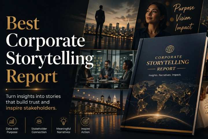
Best Corporate Storytelling Report Techniques for Stronger Annual Report Flow
The best corporate storytelling report techniques help turn an annual report from a sequence of separate disclosures into a coherent narrative about performance, direction, and leadership thinking. This matters because most stakeholders do not read annual reports as technical documents alone. They read them to understand what kind of company they are dealing with, how management interprets results, and whether the business appears stable, strategic, and credible. Storytelling helps answer those questions with structure and meaning.
A strong storytelling technique begins with a central theme. The report should not feel like a collection of unrelated sections. It should revolve around a guiding idea such as resilience, expansion, innovation, disciplined execution, sustainability, or long-term value creation. This approach supports annual report visual design best practices because the theme can guide section openers, highlight treatments, image selection, and visual pacing.
Storytelling also improves impact. The best high impact annual report design becomes more memorable when the report has a narrative direction. Readers are more likely to retain strategic highlights if they are introduced in a meaningful sequence rather than scattered across the document. Storytelling creates continuity between leadership messages, business performance, market context, governance priorities, and future outlook.
This narrative strength is particularly important for the best business performance report. Performance data rarely speaks for itself. Revenue shifts, cost pressure, investments, transformation efforts, and operational achievements all need interpretation. Storytelling helps explain why the year unfolded as it did and how the company is responding to current conditions.
Brand voice also matters. The best annual report branding is reinforced when the storytelling tone reflects the organization’s identity. Some companies communicate with formal institutional authority. Others may use a more human, accessible tone while remaining professional. What matters is consistency. The story should feel like it belongs to the brand.
Ultimately, the best corporate storytelling report techniques are not about dramatic language or promotional wording. They are about creating flow, coherence, and perspective. When annual reports are supported by strong narrative structure, they become easier to read, more persuasive to stakeholders, and more aligned with the company’s broader communication goals. Next article high impact annual report design for singapore companies.
What Are the Most Important Annual Report Visual Design Best Practices
The most important annual report visual design best practices include clear hierarchy, consistent layout systems, readable typography, structured spacing, and strong chart presentation. These principles help annual reports feel easier to navigate and more professional overall. A good report should guide the reader naturally from strategic highlights to deeper performance content without confusion.
These practices also support the best high impact annual report design, because impact depends on clarity and emphasis rather than visual overload. They also improve the best business performance report by helping stakeholders understand results faster and with less effort. When readers can identify key metrics, compare data points, and follow content flow easily, the report becomes more effective.
In addition, the best annual report branding depends on consistent visual execution across every page. The best corporate storytelling report also benefits because visual structure helps reinforce narrative order. Together, these best practices ensure that the report communicates with credibility, usability, and stronger corporate presence.
Who Should Be Involved in Creating the Best High Impact Annual Report Design
Creating the best high impact annual report design requires collaboration across multiple teams. Leadership should define key messages and strategic priorities. Finance and governance teams must ensure reporting accuracy and compliance. Communications and brand teams help shape tone, structure, and identity alignment. Design specialists translate all of this into a readable and visually coherent publication.
This multi-team process is important because annual report visual design best practices depend on both content and layout working together. A strong design cannot fix unclear messaging, and good content can still fail if the presentation is weak. The best business performance report therefore depends on cross-functional planning.
Brand and editorial contributors are also essential for the best annual report branding and the best corporate storytelling report. They help make sure the report feels consistent, distinctive, and strategically meaningful. When the right people are involved from the beginning, the report becomes clearer, more professional, and far more valuable as a corporate communication asset.
Where Do Best Annual Report Branding Methods Have the Most Business Value
The best annual report branding methods have the most business value wherever stakeholder trust and corporate perception matter. This includes investor communications, public annual reports, AGM materials, corporate websites, brand-sensitive industries, and business development settings where official documents influence credibility. In Singapore, such contexts are especially important because professionalism often shapes confidence.
These branding methods also create value inside the report itself. Combined with annual report visual design best practices, they make the publication feel more cohesive and easier to recognize. They also strengthen the best high impact annual report design, since consistent branding helps create a more memorable and controlled visual experience.
Branding works particularly well when connected to the best business performance report and the best corporate storytelling report. That connection ensures results are presented in a voice and style that reflect the company properly. The greatest value appears when branding helps the report feel not only polished, but also aligned with corporate identity and long-term reputation goals.
When Should Firms Update Their Best Business Performance Report Approach
Firms should update their best business performance report approach when their reports no longer reflect the clarity, identity, or strategic depth of the business. Warning signs include overcrowded layouts, difficult navigation, inconsistent charts, outdated visual style, weak summaries, or performance sections that feel disconnected from the company’s wider messaging.
Periods of change are especially important moments to review the report approach. Rebranding, leadership transitions, digital transformation, business expansion, market repositioning, or stronger investor expectations often require updates in both structure and presentation. At those moments, applying stronger annual report visual design best practices can significantly improve report effectiveness.
Such updates also help firms achieve the best high impact annual report design and strengthen the best annual report branding. If the story of the business has evolved, the best corporate storytelling report must evolve as well. Updating the approach at the right time helps the report remain relevant, credible, and more useful to stakeholders.
Why Does the Best Corporate Storytelling Report Improve Stakeholder Understanding
The best corporate storytelling report improves stakeholder understanding because it connects performance data with explanation, context, and direction. Readers rarely want numbers alone. They want to know what influenced results, what decisions management made, what challenges emerged, and how the company plans to move forward. Storytelling answers those questions in a structured and credible way.
This matters because annual report visual design best practices support reading flow, but storytelling supports meaning. Together, they help transform a technical document into something more understandable and more engaging. This also strengthens the best high impact annual report design, because impact increases when the report is memorable and coherent.
Storytelling also improves the best business performance report by helping readers interpret results more accurately. It supports the best annual report branding too, because the voice and tone of the narrative can reflect the company’s identity. In short, better storytelling helps stakeholders understand not just what happened, but why it matters.
How Can Singapore Firms Apply Annual Report Visual Design Best Practices Well
Singapore firms can apply annual report visual design best practices well by starting with strong planning rather than waiting until design production begins. First, they should define report objectives, key audiences, and the most important messages of the year. That strategic foundation helps every later design choice become more purposeful.
Next, they should build a visual system that supports the best high impact annual report design. This includes clear typography rules, page grids, spacing discipline, chart consistency, summary elements, and section hierarchy. They should also align the design with the best annual report branding so the report reflects the company’s identity across all pages.
From there, firms should strengthen the best business performance report through better content prioritization and clearer data presentation. Finally, they should shape the best corporate storytelling report by guiding readers through performance, context, and future direction in a logical sequence. When planning, branding, narrative, and design are aligned, best practices become much easier to execute successfully.
Strong Visual Design Best Practices Help Singapore Firms Communicate With Greater Confidence
The quality of an annual report often shapes how a company itself is perceived. For Singapore firms, where professional communication, transparency, and stakeholder trust carry significant value, annual report design should never be treated as a minor production detail. It should be approached as a strategic communication discipline. That is why annual report visual design best practices are so important. They help transform a report from a dense information archive into a clearer, more credible, and more useful corporate publication.
The strongest reports succeed because they combine several essential qualities at once. They apply the best high impact annual report design principles by using emphasis, pacing, and hierarchy with restraint and purpose. They build the best business performance report by presenting results in ways that improve understanding rather than overwhelm readers with data. They reinforce the best annual report branding by aligning visuals, tone, and identity across the full document. And they strengthen the best corporate storytelling report by shaping performance into a coherent narrative that stakeholders can follow with confidence.
These elements are not separate. They work best when integrated. A well-branded report becomes more memorable. A better-structured report becomes easier to trust. A stronger narrative makes performance more meaningful. A cleaner visual system makes all of it easier to absorb. This integrated approach is what separates ordinary reports from premium ones.
For companies that want to appear more strategic, more mature, and more stakeholder-focused, annual report design offers a major opportunity. It reflects how seriously the company takes communication and how effectively it translates complexity into clarity. Agencies such as alivea often support this process by combining editorial logic, brand understanding, and visual structure into a unified execution approach.
In the end, the best practice is not simply to make a report look better. It is to make the report work better. When Singapore firms commit to stronger visual design principles, they communicate with more confidence, reinforce their corporate identity more effectively, and give stakeholders a clearer reason to trust the business behind the report.