
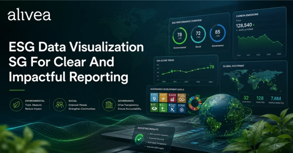
ESG Data Visualization SG Makes Sustainability Reports Clearer For Stakeholders
ESG data visualization sg has become an essential part of modern sustainability reporting because stakeholders need to understand complex environmental, social, and governance information quickly and accurately. ESG reports often contain emissions data, energy consumption, water usage, waste performance, employee demographics, safety indicators, governance structures, climate risks, targets, and year-on-year comparisons. Without strong visual communication, these details can become difficult to read, compare, and remember.
For Singapore businesses, this matters because sustainability reporting expectations are becoming more structured. SGX’s sustainability reporting guidance states that sustainability reports should include primary components such as material ESG factors, climate-related disclosures, policies, practices, performance, targets, reporting framework, and board statement. ACRA also states that listed companies must report Scope 1 and Scope 2 greenhouse gas emissions from financial years starting on or after 1 January 2025, with phased requirements applying across company profiles and timelines. This creates a stronger need for sustainability data visualization sg that can present disclosure information with clarity, accuracy, and professional structure.
A well-designed ESG visual system does more than make a report attractive. It helps readers see what matters. Charts can show performance trends. Dashboards can summarize key indicators. Icons can guide readers through environmental, social, and governance themes. Infographics can explain processes, value chains, stakeholder engagement, or climate governance. Data tables can support transparency when supported by clear labels and consistent formatting.
Professional esg data design sg also reduces misinterpretation. Every chart should explain the metric, unit, period, scope, and context. ESG reporting graphics sg should never exaggerate progress or hide challenges. Instead, visuals should make the company’s sustainability journey easier to evaluate. Strong esg data storytelling sg connects numbers with meaning, helping stakeholders understand why the data matters and how it relates to business strategy.
For companies such as alivea, ESG visualization can turn a sustainability report from a dense document into a useful corporate communication asset. The goal is not only to present data beautifully. The goal is to help stakeholders understand performance, trust the evidence, and engage with the company’s ESG direction.
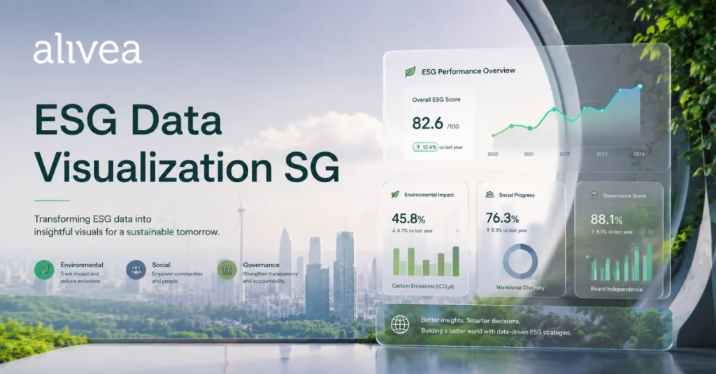
ESG Data Visualization SG Turns Complex Metrics Into Readable Business Insight
ESG data visualization SG helps businesses turn technical sustainability metrics into readable business insight. Many ESG figures are important, but they can be difficult for general stakeholders to interpret without visual structure. A number such as total emissions, electricity consumption, waste generated, employee training hours, or board diversity percentage becomes more meaningful when it is supported by context, comparison, and explanation. This is where professional sustainability data visualization sg becomes valuable.
A strong visualization approach begins with understanding the purpose of each metric. Some figures show performance over time. Others compare business units, locations, or categories. Some demonstrate progress against targets. Others explain risk exposure or operational impact. Each type of information needs a different visual treatment. A line chart may be useful for long-term trends. A bar chart may work for year-on-year comparison. A dashboard may summarize multiple indicators. A matrix may show materiality or priority levels. A flow diagram may explain process or governance.
The best esg data design sg does not overload the reader. A report that uses too many chart styles, colors, icons, and graphic elements can create confusion. Clear design uses visual hierarchy, consistent labels, and logical spacing. It allows the most important data to stand out while keeping supporting information accessible. This helps stakeholders move through the report without feeling overwhelmed.
ESG reporting graphics sg should also respect accuracy. A chart with a distorted scale or unclear baseline can mislead readers, even if unintentionally. A table with missing units can make performance difficult to compare. A dashboard that highlights only positive results may feel selective. Good ESG visualization presents information honestly, including both progress and improvement areas.
For corporate reporting, insight is more important than decoration. Stakeholders want to know what the data means for the business. Did emissions fall because of efficiency improvements, reduced activity, renewable energy, or reporting boundary changes? Did training hours increase because of compliance programs, leadership development, or digital learning? Did safety performance improve because of new procedures or better monitoring?
ESG data storytelling sg connects these explanations to the visuals. The result is a report that helps readers understand not only the numbers, but also the company’s actions, priorities, and direction.
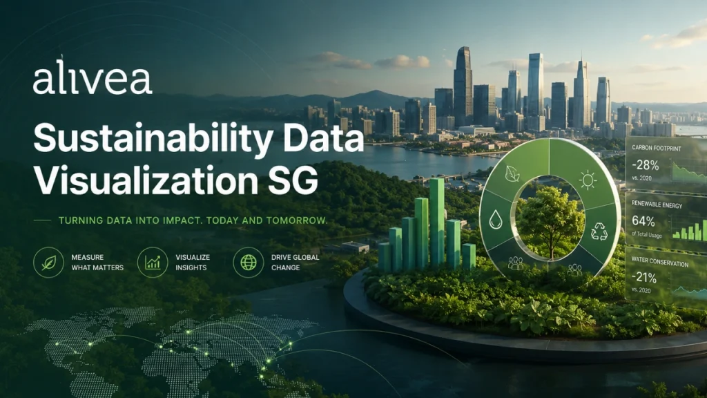
Sustainability Data Visualization SG Clarifies Environmental And Social Progress
Sustainability data visualization sg is especially important when companies need to present environmental and social progress in a way that is balanced, transparent, and easy to understand. Environmental data can involve emissions, energy, water, waste, materials, transportation, and climate-related risks. Social data can involve employees, safety, training, diversity, customer responsibility, community investment, and human capital development. These topics are broad, so the report needs visuals that organize information clearly.
Environmental metrics often require careful explanation. For example, Scope 1 and Scope 2 emissions should be presented with boundaries, units, reporting periods, and methodology notes where relevant. ACRA’s timeline confirms that Scope 1 and Scope 2 greenhouse gas emissions reporting remains mandatory for all listed companies from FY2025. Because climate and emissions information may be reviewed by investors, regulators, customers, and business partners, sustainability data visualization sg should make the information traceable and understandable.
Environmental charts can show energy reduction, carbon intensity, renewable electricity use, water consumption, waste diversion, or recycling rates. However, each chart should be matched to the message. If the company wants to show progress over several years, a trend chart may work. If it wants to compare categories, a bar chart may be clearer. If it wants to explain a decarbonization roadmap, a timeline or pathway graphic may be more effective.
Social data also benefits from visual clarity. Employee demographics, training hours, safety performance, engagement scores, and community contribution can become more meaningful when shown through dashboards, grouped tables, or simple graphics. ESG data design sg should avoid turning people-related information into cold numbers. The report can combine metrics with short narratives, case studies, and human-centered visuals to show how social initiatives affect employees, customers, or communities.
ESG reporting graphics sg should also make limitations clear. If social data covers only a certain region, department, or employee category, the report should state that clearly. If environmental performance changed due to operational expansion, acquisition, or methodology updates, the visualization should not hide that context.
Strong esg data storytelling sg connects environmental and social performance to business outcomes. It helps readers understand how sustainability progress supports efficiency, resilience, culture, reputation, and responsible growth. This makes the report more useful for decision-making and more credible for long-term stakeholder trust.
ESG Data Design SG Builds Consistent Dashboards, Charts, And Report Pages
ESG data design SG gives sustainability reports a consistent visual system that helps readers navigate information with confidence. A report may contain many types of content, including leadership messages, ESG highlights, materiality results, governance explanations, performance tables, climate metrics, case studies, and future targets. Without a clear design system, the report may feel fragmented. With strong esg data visualization sg, every page can feel connected and purposeful.
Consistency begins with dashboard design. ESG dashboards are useful because they summarize key indicators in one place. A dashboard may include emissions, energy, water, waste, employee training, safety performance, diversity, governance indicators, and progress against targets. However, dashboards must be carefully designed. Too many metrics on one page can reduce clarity. The most important indicators should be prioritized, grouped by theme, and supported by simple labels.
Sustainability data visualization sg also requires chart consistency. Similar metrics should use similar chart styles across the report. For example, year-on-year performance charts should follow the same logic, while category comparisons should use a consistent layout. This helps readers understand the data faster because they do not need to relearn the visual system on every page.
ESG data design sg should also consider typography, spacing, captions, footnotes, and legends. Small details affect credibility. A chart title should explain what the reader is looking at. A caption can add interpretation. A footnote can clarify methodology or boundary. A legend should be easy to understand. A page should have enough white space so dense ESG information does not feel tiring.
ESG reporting graphics sg should be designed for both PDF and digital environments. Stakeholders may view reports on large desktop screens, laptops, tablets, or mobile devices. Some may print selected pages. Others may extract charts for presentations. This means data visuals need to be clear, scalable, and readable in different formats.
Good design also supports accessibility. High contrast, readable text sizes, clear patterns, and simple structure make ESG information easier for more people to use. Google’s Search guidance encourages helpful, reliable, people-first content created for users rather than search engines alone. In ESG reporting, this principle means visuals should serve real readers, not only make the report appear impressive.
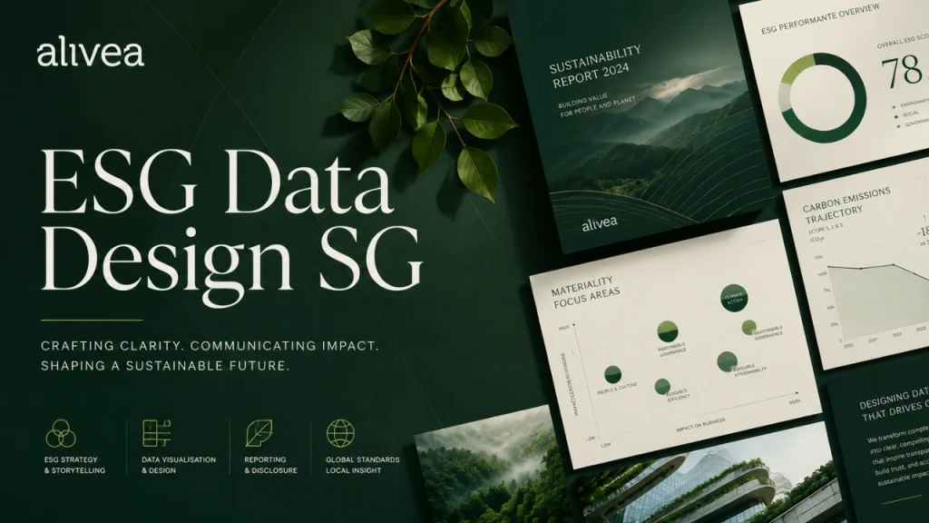
ESG Reporting Graphics SG Improve Readability Across Corporate Disclosures
ESG reporting graphics SG improve readability by turning dense disclosure sections into structured visual communication. Corporate sustainability reports often contain policy explanations, governance responsibilities, risk descriptions, climate disclosures, materiality processes, stakeholder engagement outcomes, and performance data. If everything is presented as long text, readers may miss important information. Good graphics create entry points that help stakeholders understand the report faster.
A materiality matrix is one common ESG graphic. It helps show which topics are most important to the business and stakeholders. However, the matrix should be supported by explanation. Readers need to understand how topics were selected, who was consulted, and how the results influence reporting. SGX guidance expects sustainability reports to identify material ESG factors and describe both the reasons for and the process of selection. This makes clear visualization important, because the graphic must support transparency rather than function as decoration.
Governance graphics are also valuable. A board oversight structure, ESG committee flow, risk management process, or internal reporting line can be shown more clearly through diagrams than long paragraphs. These visuals help readers understand who is accountable, how decisions are made, and how ESG issues are monitored.
Performance graphics make disclosure easier to compare. ESG data visualization sg can present year-on-year performance, target progress, baseline comparison, or operational changes. When readers can quickly see whether performance improved, declined, or remained stable, they can engage more deeply with the explanation.
Sustainability data visualization sg also supports report navigation. Section icons, topic labels, color-coded ESG pillars, and summary cards help readers move through a long report. These elements are especially useful when the report is used by different audiences, such as investors, employees, customers, partners, and regulators.
ESG data design sg should still remain restrained. Too many graphic elements can weaken seriousness. A premium ESG report often feels calm, organized, and evidence-based. ESG data storytelling sg becomes stronger when graphics are purposeful, accurate, and integrated with narrative. The best graphics help stakeholders understand disclosure standards, not distract them from the substance of the report.
ESG Data Storytelling SG Connects Numbers, Context, And Corporate Purpose
ESG data storytelling SG connects numbers with context so stakeholders can understand the meaning behind sustainability performance. Data alone does not always create understanding. A chart may show that emissions decreased, but readers still need to know why. A table may show higher training hours, but stakeholders need to understand what skills were developed. A dashboard may show safety results, but readers need to know what actions improved workplace conditions. Storytelling turns data into a clearer corporate message.
Strong esg data visualization sg begins with the question: what should the reader learn from this metric? If the answer is unclear, the visual may not be necessary. Every chart, dashboard, infographic, or diagram should support a specific insight. This keeps the report focused and prevents visual clutter.
Sustainability data visualization sg should also connect short-term performance with long-term direction. Stakeholders may want to understand whether the company has a decarbonization plan, workforce development roadmap, governance improvement program, or responsible sourcing strategy. A timeline, roadmap, or target tracker can help show progress and future commitments in a simple way.
ESG data design sg should balance narrative and evidence. If the report tells a strong story but provides weak data, it may feel promotional. If it provides data without explanation, it may feel cold or incomplete. The best ESG reports combine both. They show measurable performance and explain the business action behind it.
ESG reporting graphics sg can also support credibility by showing consistency between goals and outcomes. If a company sets a target, the report should show progress against that target. If a company highlights a material topic, the report should provide related metrics or evidence. If a company discusses climate risk, the report should explain governance, strategy, risk management, metrics, and targets where relevant. ISSB’s IFRS S1 and IFRS S2 include reporting requirements across governance, strategy, risk management, and metrics and targets.
For brands such as alivea, esg data storytelling sg can make corporate sustainability communication more human, useful, and memorable. It helps transform a report from a data-heavy document into a clear explanation of responsibility, progress, and future direction. Editor’s choice best esg report sg solutions for corporate reporting and design.
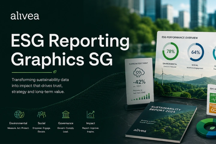
What Does ESG Data Visualization SG Mean For Sustainability Reports?
ESG data visualization SG means presenting sustainability data through clear charts, dashboards, diagrams, infographics, tables, and visual summaries. Its purpose is to make environmental, social, and governance information easier to understand, compare, and remember. A strong visual system helps stakeholders see key metrics, trends, targets, and performance gaps without struggling through dense text.
In sustainability reports, esg data visualization sg may include emissions charts, energy dashboards, safety performance graphics, employee diversity visuals, governance diagrams, and materiality matrices. Sustainability data visualization sg supports transparency because it helps readers understand how ESG data connects to policies, actions, and outcomes.
ESG data design sg should always prioritize accuracy. ESG reporting graphics sg should include clear labels, units, time periods, and explanations. ESG data storytelling sg then adds context, helping readers understand why the numbers matter and what they reveal about corporate responsibility.
Who Needs Sustainability Data Visualization SG For Better ESG Reports?
Sustainability data visualization SG is useful for listed companies, large private businesses, SMEs preparing sustainability reports, regional brands, and organizations that communicate ESG performance to stakeholders. Any company with complex ESG data can benefit from clearer visual presentation.
Investors may need esg data visualization sg to assess climate exposure, performance trends, and governance maturity. Customers may look for responsible sourcing, environmental action, or ethical operations. Employees may want to understand workplace safety, training, inclusion, and culture. Business partners may review ESG information before collaboration.
ESG data design sg also helps internal teams. Sustainability, finance, HR, operations, legal, and communications teams can use visuals to review information more efficiently. ESG reporting graphics sg make reports easier to discuss with leadership, boards, and stakeholders. ESG data storytelling sg helps companies explain progress in a more structured and credible way.

Where Should ESG Data Design SG Be Used Across Corporate Reports?
ESG data design SG should be used wherever sustainability information needs to be explained clearly. This includes annual sustainability reports, ESG reports, annual reports, investor presentations, corporate websites, board decks, procurement documents, tender submissions, and stakeholder summaries.
In a full ESG report, esg data visualization sg can support dashboards, section openers, performance pages, case studies, governance explanations, and climate disclosures. On a website, sustainability data visualization sg can help users quickly understand highlights before downloading the full report.
ESG reporting graphics sg should also be consistent across channels. If the report uses one set of metrics and the website uses another format, stakeholders may become confused. ESG data storytelling sg creates alignment by connecting the same data, message, and visual logic across every corporate communication touchpoint.
When Should ESG Reporting Graphics SG Be Planned In The Report Process?
ESG reporting graphics SG should be planned early in the reporting process, not after all content is finished. Early planning helps teams decide which metrics need charts, which sections need dashboards, and which topics require infographics or diagrams. This prevents the report from becoming a last-minute design exercise.
ESG data visualization sg works best when designers, writers, sustainability teams, and data owners collaborate from the beginning. Sustainability data visualization sg may require specific data formats, time periods, comparisons, or target information. If these requirements are known early, teams can collect better evidence.
ESG data design sg also affects page structure. Some content may be easier to explain visually than through long paragraphs. ESG data storytelling sg becomes stronger when visuals and narrative are developed together, creating a report that feels organized, readable, and stakeholder-ready.
Why Does ESG Data Storytelling SG Improve Stakeholder Engagement?
ESG data storytelling SG improves stakeholder engagement because it helps readers understand the meaning behind sustainability data. Many stakeholders do not want to review long tables without context. They want to know what changed, why it changed, and how the company is responding.
ESG data visualization sg gives readers visual entry points. Sustainability data visualization sg helps simplify complex topics such as emissions, energy use, employee safety, governance structures, and target progress. ESG data design sg then organizes these visuals into a consistent report experience.
ESG reporting graphics sg also make ESG reports easier to scan. Busy investors, customers, employees, and partners can identify key information quickly. ESG data storytelling sg connects performance with business action, making the report more useful and memorable. This improves trust because stakeholders can see both the data and the explanation behind it.
How Can Companies Build ESG Data Visualization SG More Effectively?
Companies can build ESG data visualization SG more effectively by starting with clear reporting goals and reliable data. The first step is to identify which ESG metrics matter most to stakeholders. The second step is to confirm data sources, reporting periods, units, and boundaries. The third step is to choose the right visual format for each insight.
Sustainability data visualization sg should avoid unnecessary complexity. A simple chart with clear labels is often better than a decorative graphic that confuses the message. ESG data design sg should use consistent styles, readable typography, and logical grouping.
ESG reporting graphics sg should be reviewed for accuracy before publication. Data owners should confirm figures, labels, and context. ESG data storytelling sg should then explain what the visuals mean, how performance changed, and what actions the company is taking next. This creates clearer, stronger, and more credible ESG reporting.
ESG Data Visualization SG Turns Complex Reporting Into Clear Insight
ESG data visualization SG helps companies make sustainability reporting clearer, more engaging, and more useful for stakeholders. As ESG disclosure becomes more data-driven, businesses need a better way to present environmental, social, and governance information. Long paragraphs and dense tables are not always enough. Stakeholders need charts, dashboards, diagrams, infographics, and visual summaries that help them understand performance quickly and accurately.
The value of sustainability data visualization sg begins with clarity. A strong visual system helps readers identify trends, compare metrics, track targets, and understand the relationship between actions and outcomes. It also reduces confusion by presenting information in a structured way. When charts are labeled clearly, dashboards are organized logically, and graphics are supported by explanation, ESG reporting becomes easier to evaluate.
ESG data design sg also supports credibility. A professional report should not use visuals to exaggerate success or hide challenges. It should present information honestly, with clear units, reporting periods, scopes, and context. This helps stakeholders trust the report because they can see how data supports the company’s sustainability narrative.
ESG reporting graphics sg improve the reading experience across annual reports, ESG reports, investor presentations, corporate websites, and stakeholder summaries. They make complex topics easier to scan and help different audiences find the information they need. Investors may focus on performance and risk. Employees may look for social impact and workplace progress. Customers may review environmental responsibility and ethical practices. Partners may assess ESG maturity before collaboration.
ESG data storytelling sg brings all these elements together. It connects numbers with purpose, action, and future direction. For companies such as alivea, this approach can turn sustainability reporting into a stronger communication asset. The final report should not only look polished. It should help stakeholders understand what the company measures, why it matters, how progress is managed, and where the business is heading next.
When ESG data is visualized with accuracy and purpose, reporting becomes more than compliance. It becomes a clear expression of accountability, transparency, and sustainable business growth.
